Reimagining museum hubs
Designing a more welcoming and connected visitor experience across the entrance and cafeteria of Milan's Museo Nazionale della Scienza e della Tecnologia Leonardo da Vinci.
Designing for culture and heritage
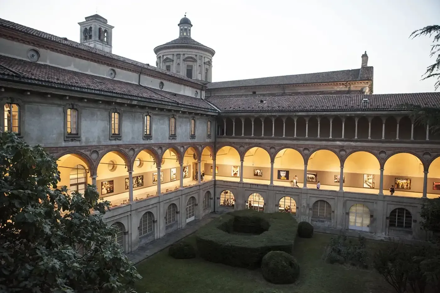
The Museo Nazionale della Scienza e della Tecnologia Leonardo da Vinci is Italy’s largest science and technology museum, housed in a sixteenth century monastery in Milan. It invited Domus Academy students to rethink two of its visitor spaces: the entrance, and the cafeteria and picnic area.
Neither was framed as an interior problem. The question was what these spaces contribute to the visit as a whole, which is a different question and a harder one.
I worked alongside interior designers. They took spatial planning, layout, materials and the physical environment. I took the visitor journeys, the interaction touchpoints, the service ecosystem and how information and navigation would work across both.
- Visitor flow
- Information
- Navigation
- Museum identity
- Accessibility
- Social interaction
- Comfort and engagement
Two spaces doing less than they could
The museum has a remarkable collection and a strong identity. Very little of either was present in the first space a visitor walks into.
The entrance worked as a transaction. Buy a ticket, pass a counter, start walking. It did not say what was inside, how long any of it takes, or which parts might matter to the person standing there. A visitor made their first decisions about a large and complicated museum with almost nothing to go on.
The cafeteria had a related problem in a different form. It was somewhere to eat that happened to be inside a museum, rather than part of the visit. The break in the middle of a day out is not dead time. It is when people compare notes, decide what to see next, and recover enough attention to keep going.
How might we turn functional museum spaces into meaningful parts of the visitor journey?
Watching the experience where it happens
We spent time in the museum photographing and observing both spaces, then laid every observation back onto the floor plan so a problem could be located rather than just described.
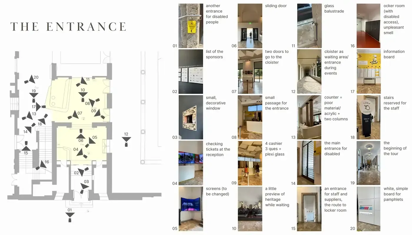
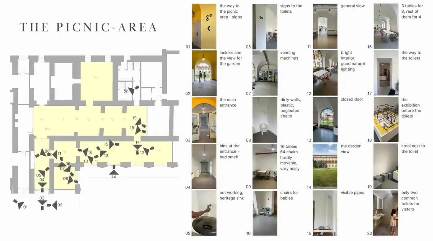
Photographing systematically rather than selectively is what made the boards useful. It is easy to notice the counter and miss the fact that the bins sit at the entrance to the room where people eat. Both are on the board.
Photo ethnography
Every point in both spaces, photographed from a fixed position on the plan. This is what surfaced the smells, the noise, the neglected furniture and the pipes.
Observation
Watching how people actually moved, where they stopped, where they hesitated and where school groups collided with everyone else.
Stakeholder conversations
Receptionists, guides and museum staff, who know the failure modes of a building far better than a visitor passing through once.
Communication analysis
The website, the signage and the printed material, read as one system rather than separately. This is where the identity gap showed up.
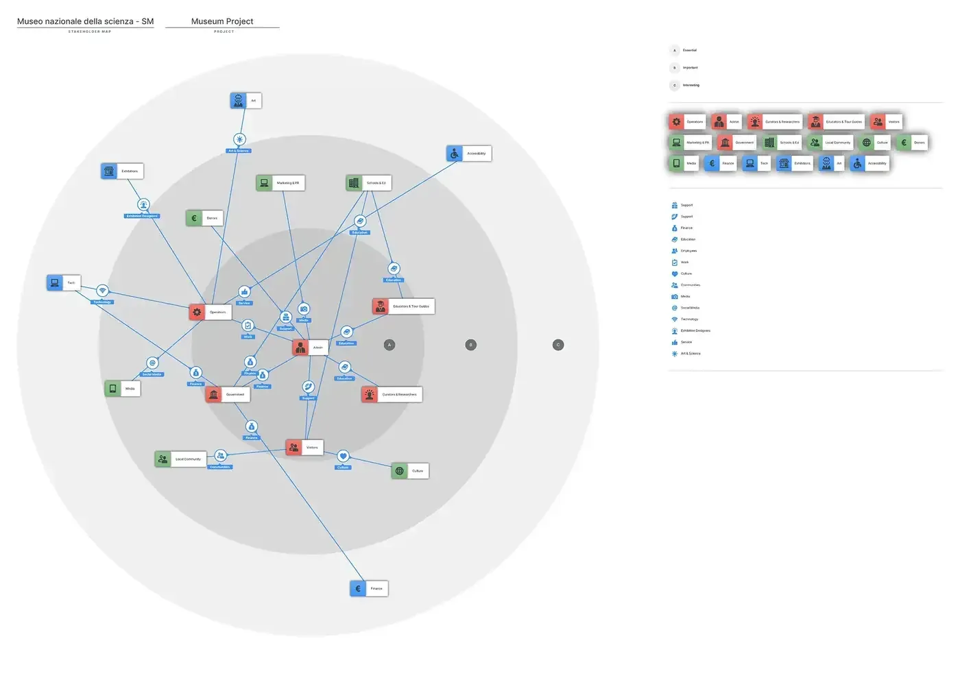
A museum is not a building with exhibits in it
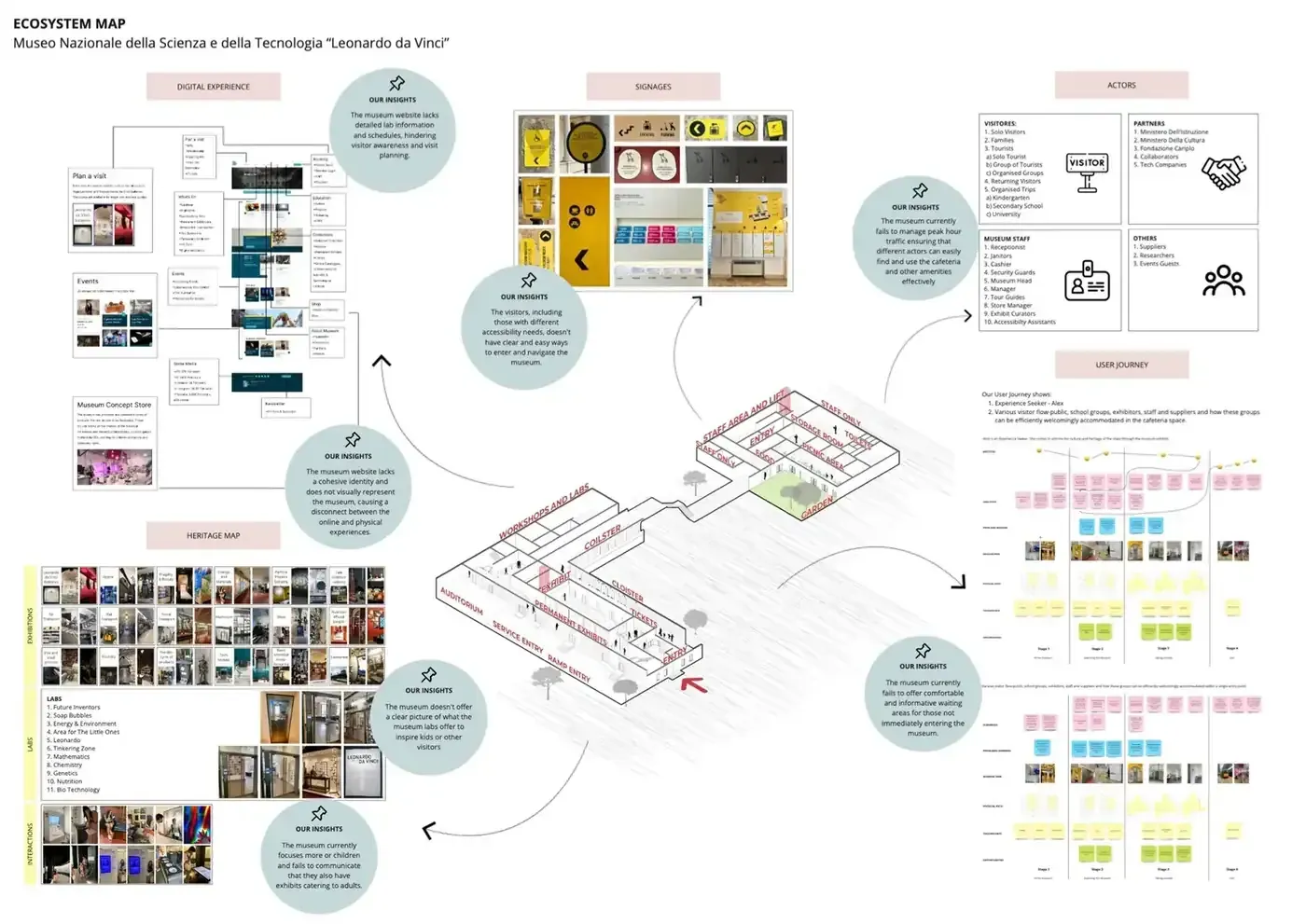
The reason to map the ecosystem was not thoroughness. It was that we kept finding problems whose cause sat somewhere else entirely.
A visitor who cannot judge how long the museum takes will misjudge when to eat. They arrive at the cafeteria at the same time as three school groups. The cafeteria is loud and short of seats, so they cut the break short, and the rest of the visit suffers. The problem shows up in the cafeteria. It was caused at the entrance.
- Entrance
- Ticketing
- Navigation
- Exhibits
- Time
- Cafeteria
- Exit
So we mapped four layers together: the people, the spaces, the services and the museum’s own heritage and identity.
There is no single visitor
The museum is used in ways that have almost nothing in common. A school group of thirty arrives on a schedule with bags to store and a guide to follow. A tourist has an afternoon and wants the famous things. A parent with two children is optimising for attention span. Someone local on a repeat visit is going to one gallery on purpose.
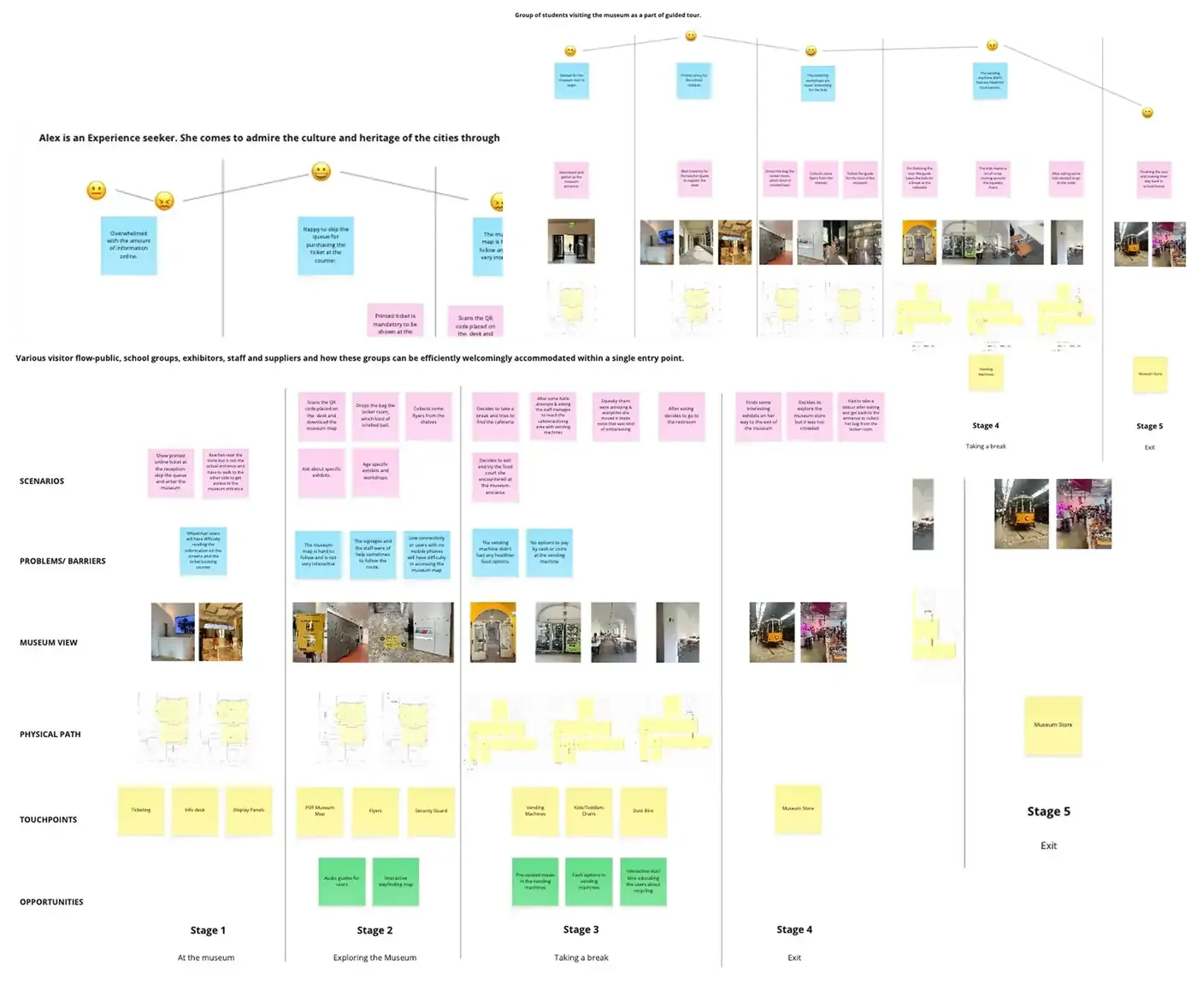
We mapped them separately and then read them against each other. The stages where the lines agreed were fine. The stages where they pulled apart were where a single fixed experience was failing somebody.
| Visitor | Arrives with | Needs most |
|---|---|---|
| School group | A schedule, a guide, thirty bags | Storage, a route, somewhere to eat together |
| Tourist | Limited time, high expectations | The highlights, and how long they take |
| Family | Children and a short attention span | Pacing, breaks, things to do at child height |
| Solo or repeat visitor | A specific intention | Directness, and not being routed through a tour |
Three things the research kept returning to
The museum talks to children
Communication leans heavily towards children, in the signage, the website and the framing of activities. A great deal of the collection rewards an adult audience, and very little of the museum says so. Adults are not excluded, but they are not invited either.
Peak hours turn into guesswork
When the museum is busy, a visitor cannot tell where to go, what to prioritise, how long anything takes or where it is acceptable to wait. Uncertainty at the door becomes congestion further in, because everybody makes the same default choice at the same time.
The physical and digital museums feel unrelated
The website and the building do not share an atmosphere, a voice or a visual language. Someone who plans a visit online and then walks in arrives somewhere they have not seen before, and has to start orienting from scratch.
Information, navigation, identity
The research produced a long list of things that could be improved. Most of them collapsed into three, and holding to three is what kept the two spaces from being designed as separate projects.
Information
How might we help visitors understand what the museum offers as soon as they arrive, including how long it takes?
Navigation
How might we make it easier for different kinds of visitor to find their own way through the building?
Identity
How might we make every touchpoint feel like part of the same museum?
Every proposal that follows is answering at least one of these. Several answer all three, which is usually how we knew the idea was worth keeping.
What we borrowed, and from where
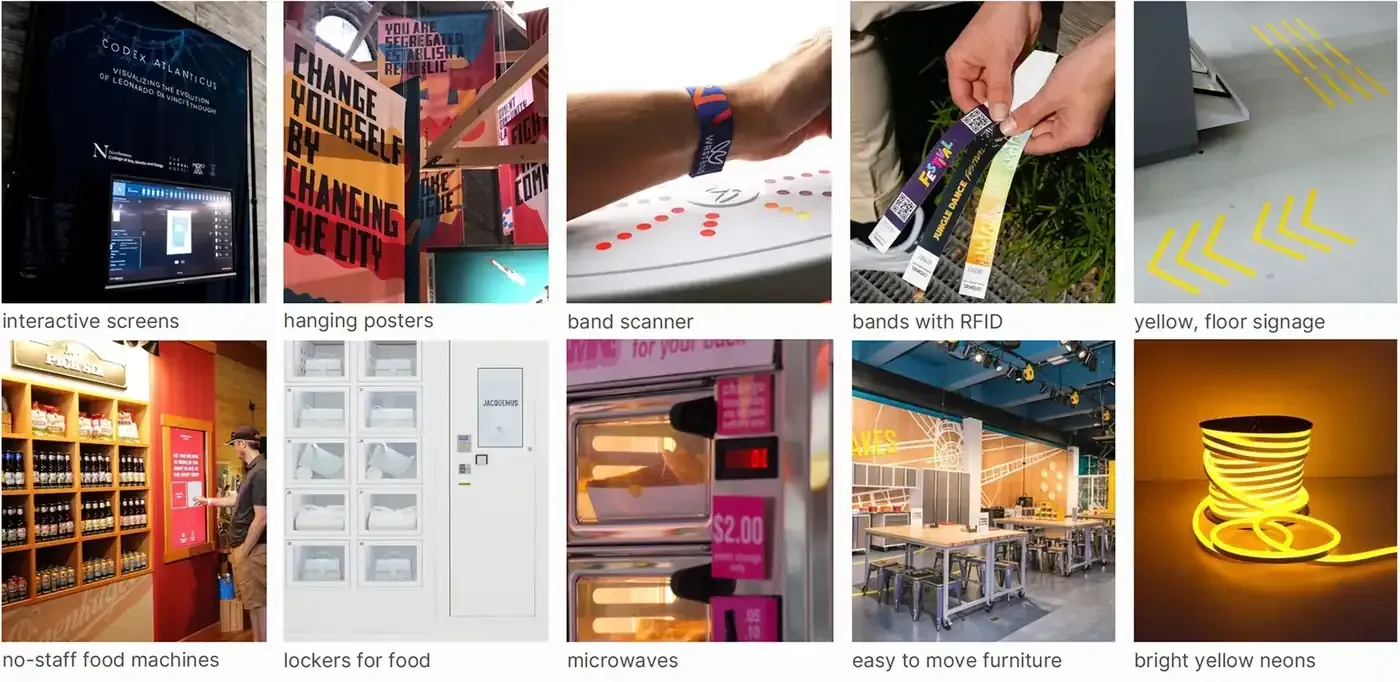
Two things on this board did most of the work. Yellow floor signage, because it survives a crowd in a way that wall signage does not, and it can be laid into a heritage building without touching the walls. And the festival wristband, because it is a piece of technology people already know how to use, that carries an identity without needing a screen.
Making arrival the start of the visit
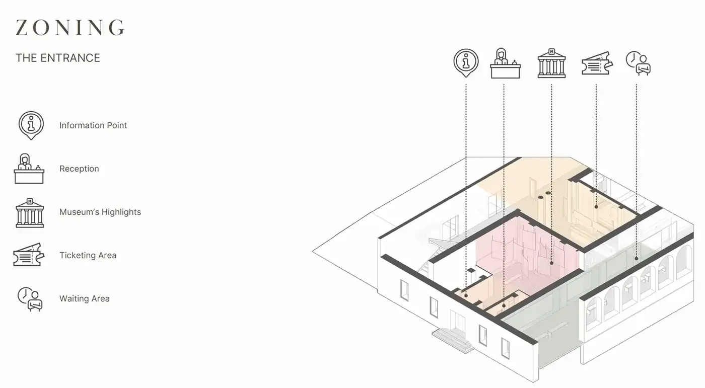
The entrance was reorganised around what a visitor needs to do rather than what the building needs to process. Ticketing becomes visible instead of hidden behind a queue. An information point sits before the ticket desk, so the questions get answered before somebody is holding up a line.
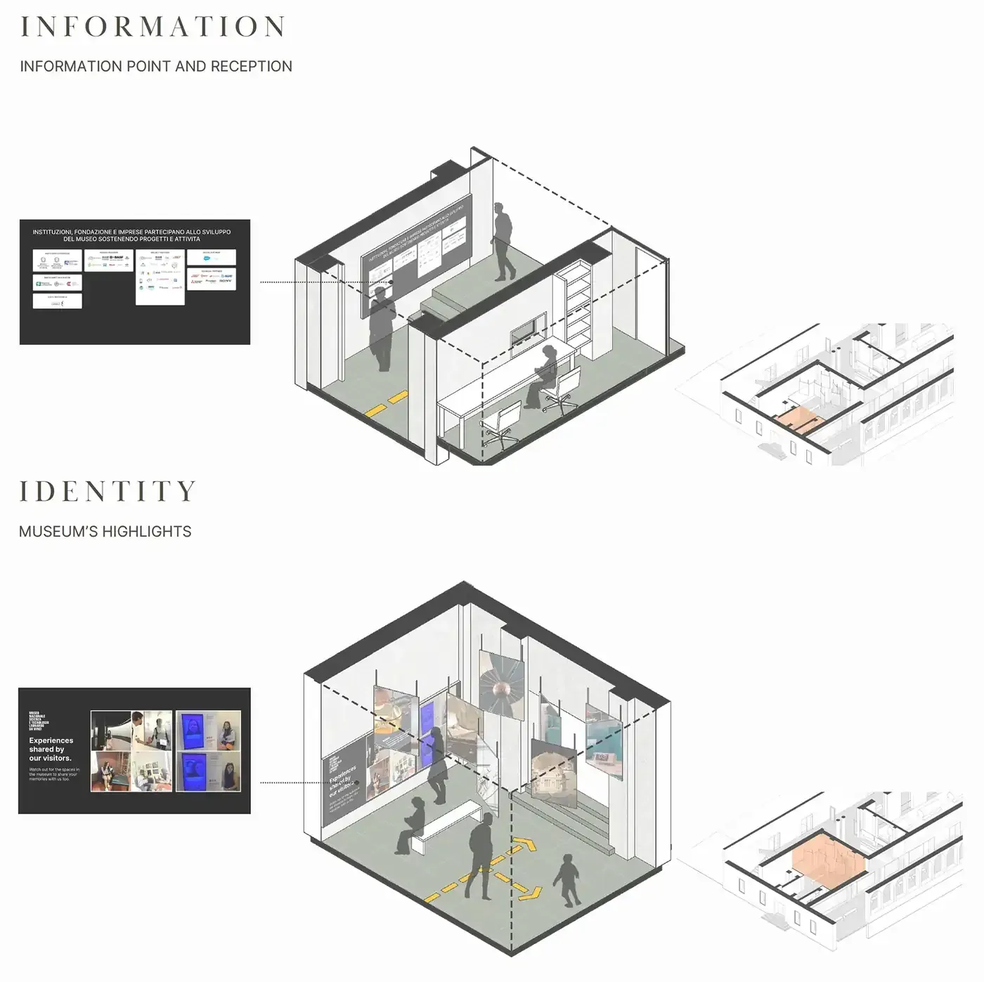
The highlights room is the part I would defend hardest. It answers the adult-audience insight without a campaign or a rebrand: it simply shows what is in the building, at the moment the visitor is deciding what to care about.
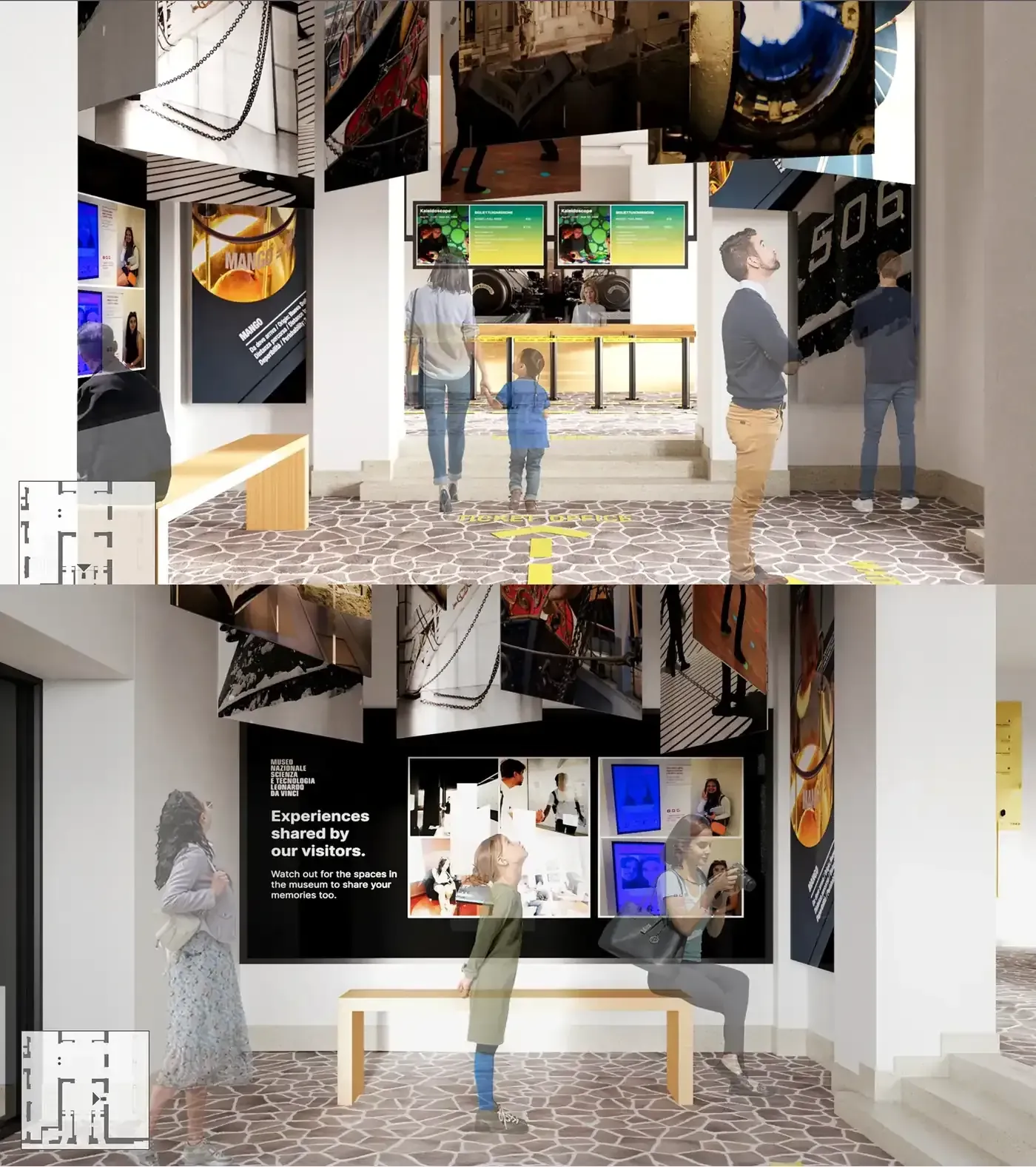
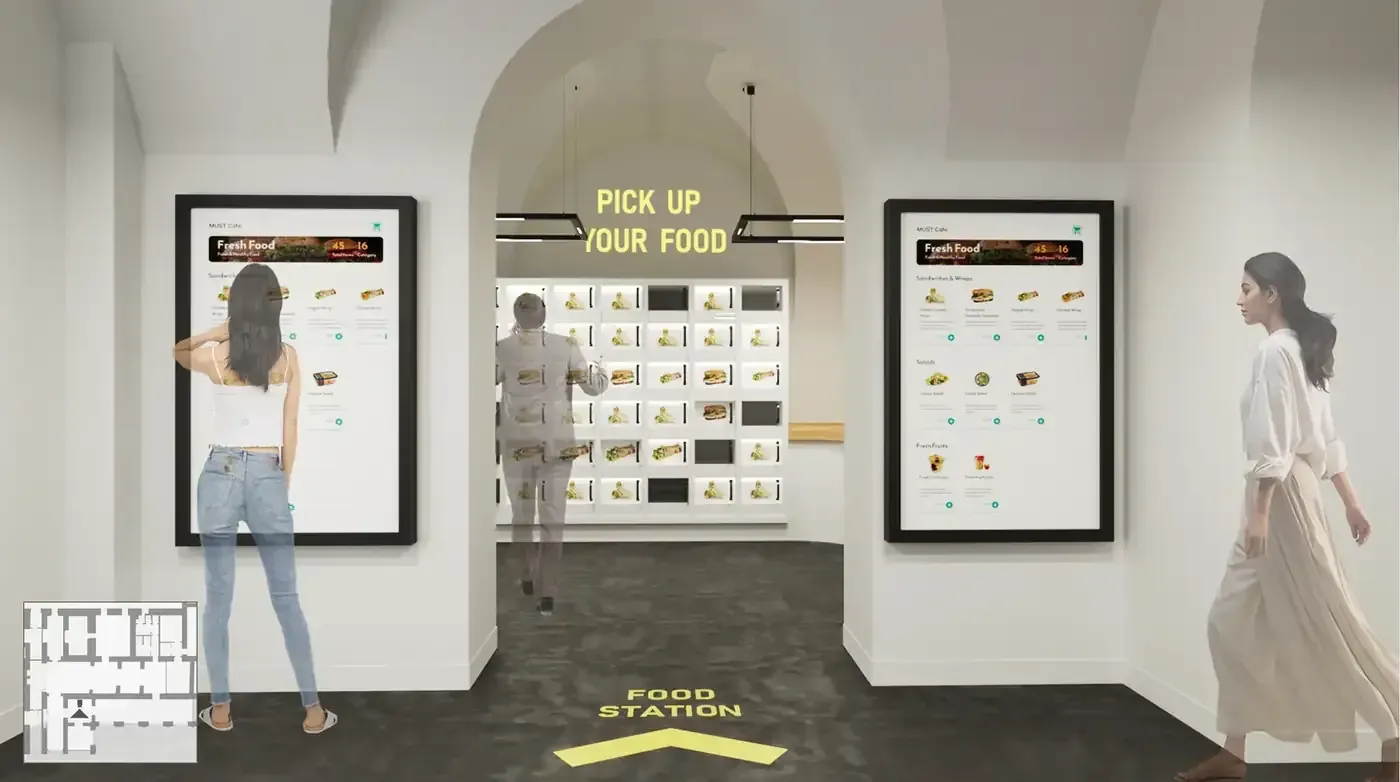
Note where the information lives. Overhead and underfoot, because those are the two surfaces a crowd cannot block, and because in a protected sixteenth century interior they are also the two you are most free to use.
Giving visitors a way through that is theirs
The peak-hour insight has an obvious bad answer: tell everyone the same recommended route and watch them all take it together. The proposal instead gives each visitor a route shaped by what they came for.
- Collect a band
- Scan and choose interests
- Get a route
- Scan at exhibits
- Scan on the way out
- Keep the visit
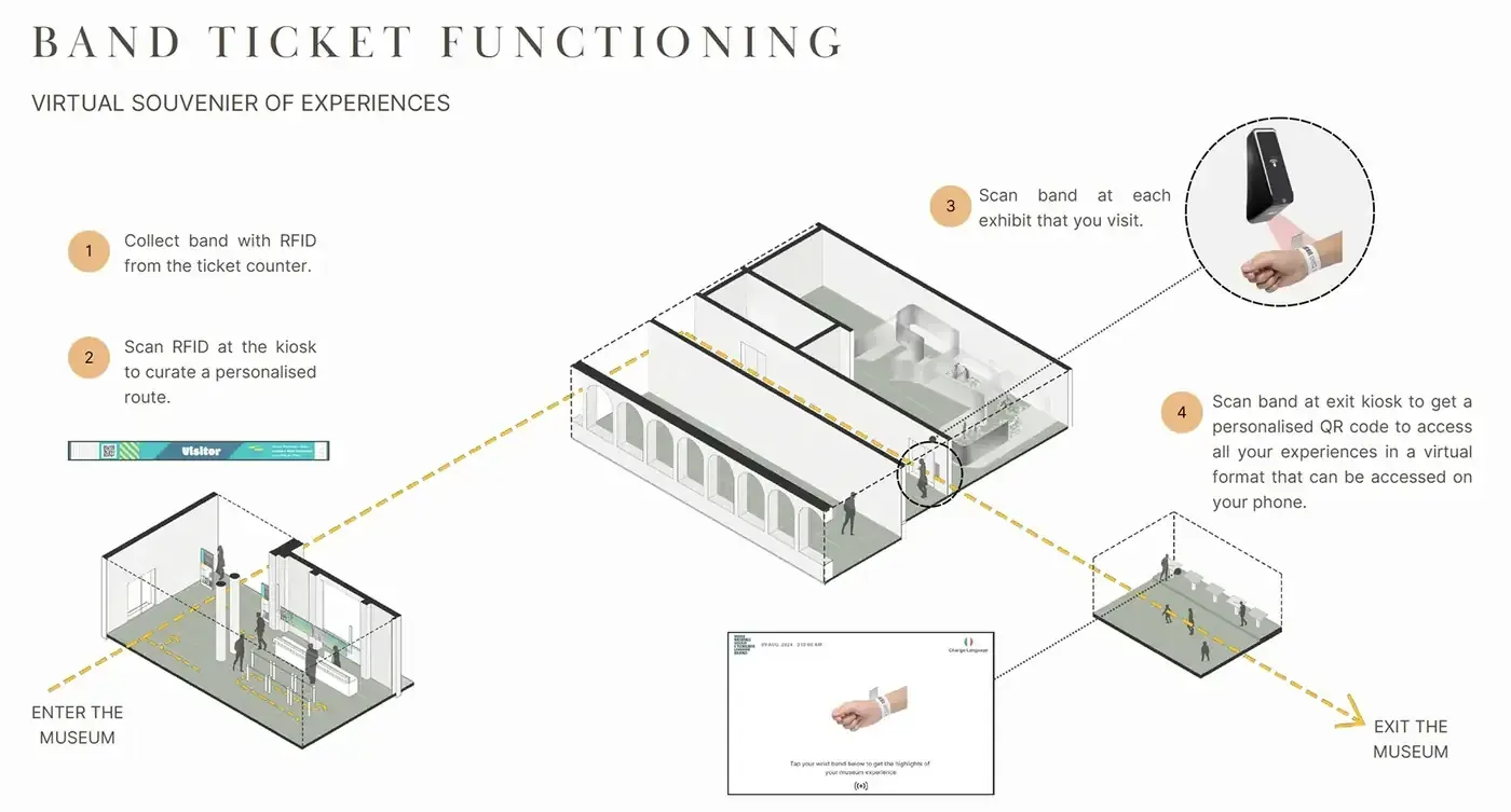
Two decisions matter here. The band works without a phone, because requiring a download at the door excludes exactly the visitors who are already having the hardest time. And the personal record is generated on the way out rather than during the visit, so nobody spends the museum looking at a screen.
Designing the break as part of the visit
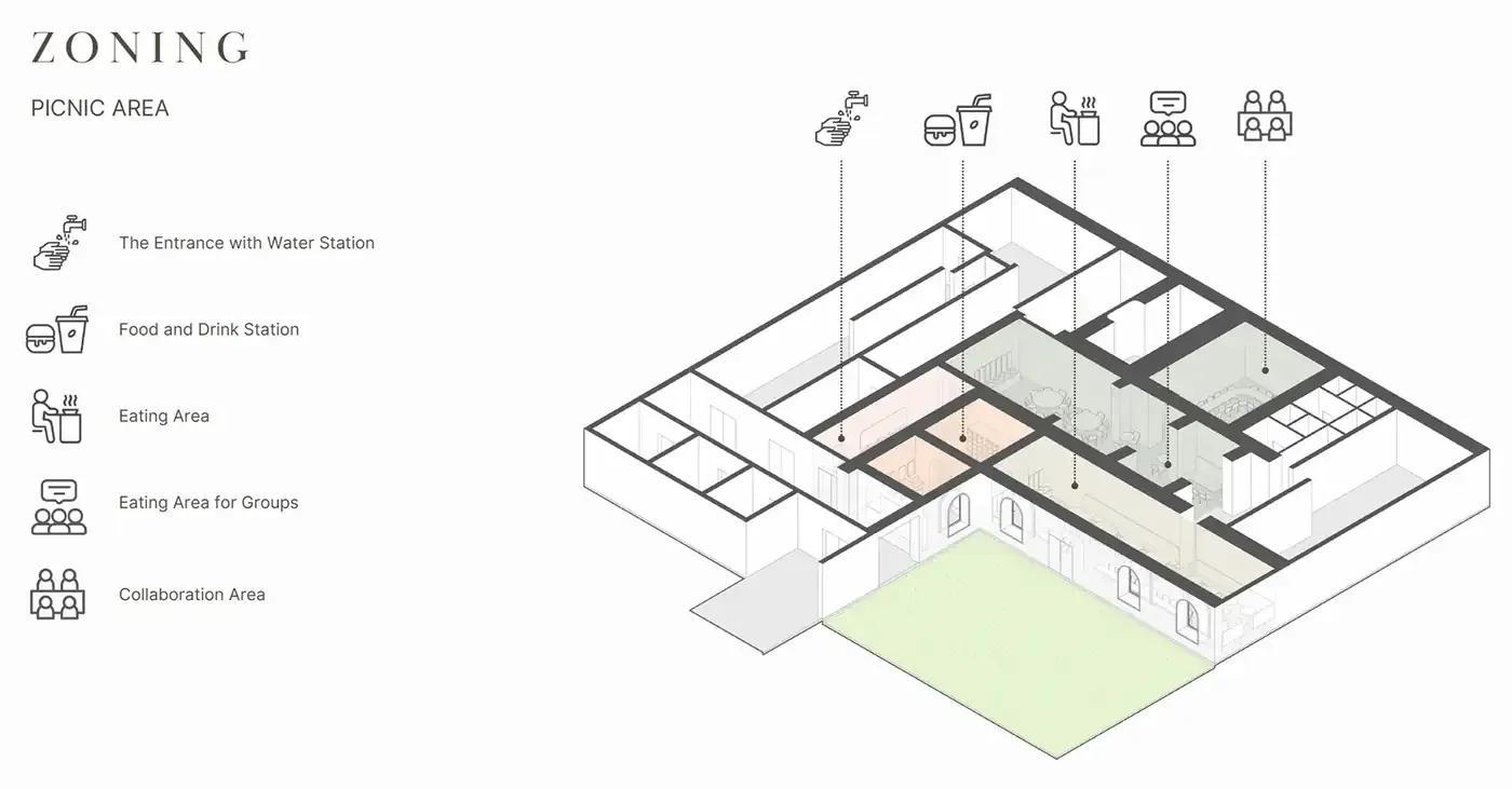
The picnic area had one undifferentiated room doing every job at once. School groups, families and adults eating alone were all in the same space, at the same tables, at the same time. Separating the zones is most of the fix.
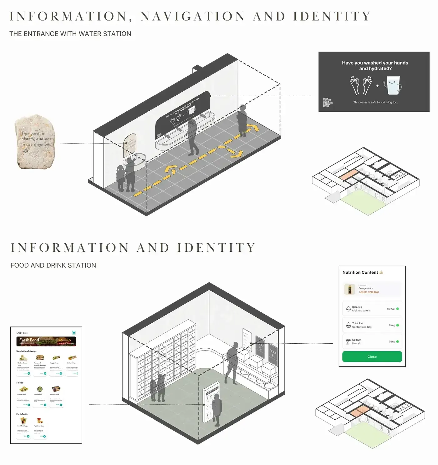
That plaque is my favourite detail in the project. The survey board recorded the old sink as a fault, not working, heritage sink. It is a science and technology museum. An object that no longer works and explains why it is still there is entirely on-brief.
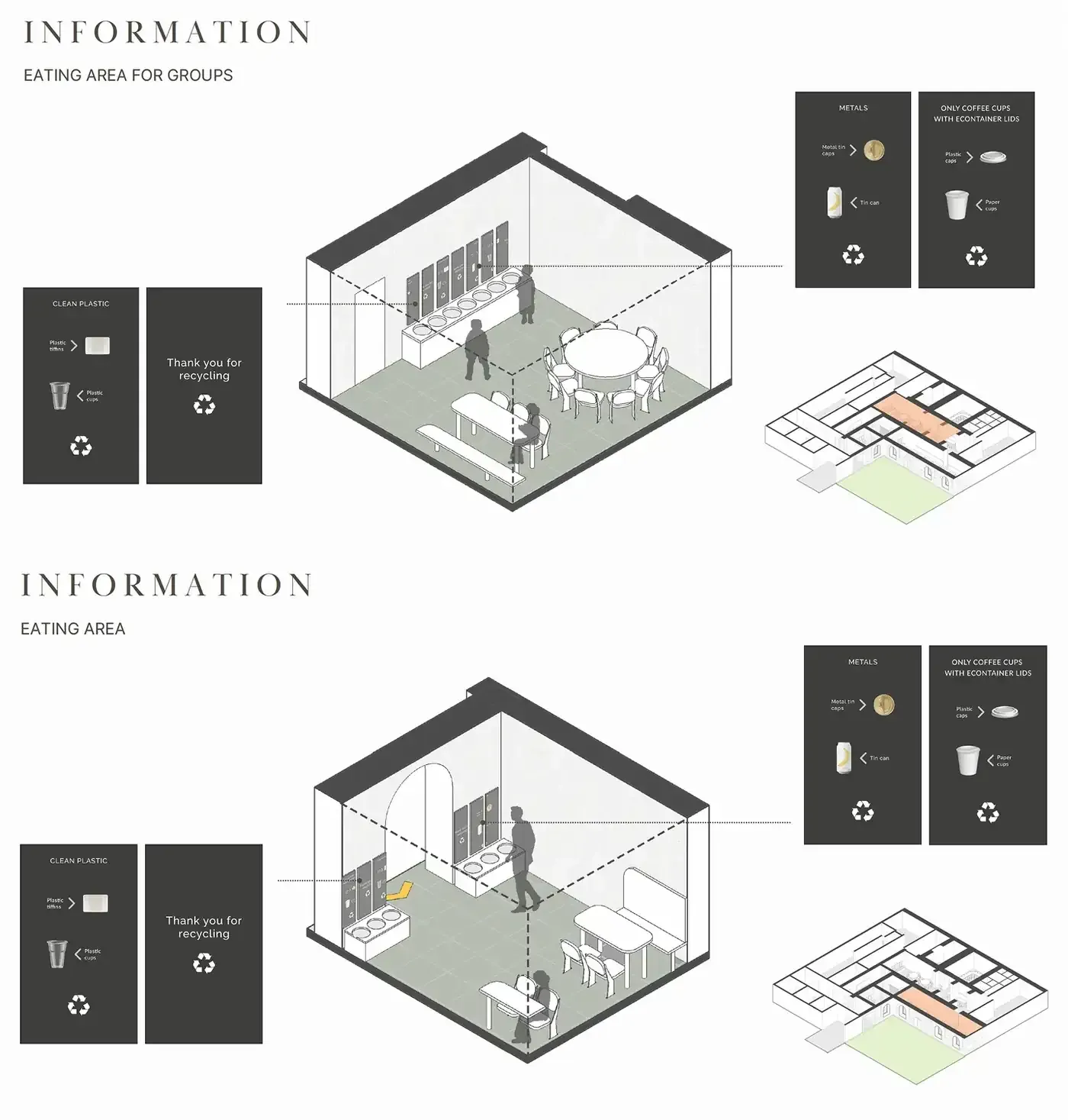
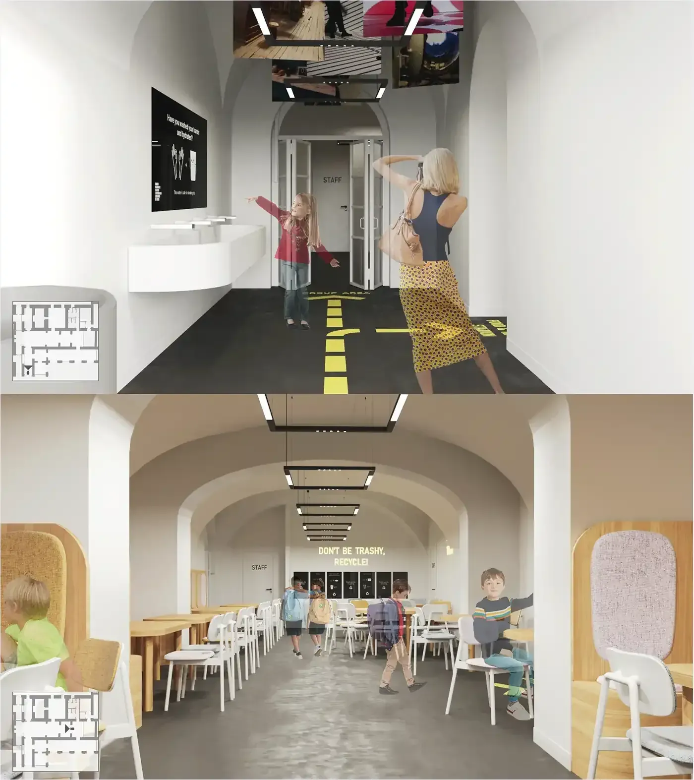
The seating mix is doing the accessibility work. Sixty-four identical noisy chairs serve nobody in particular. Booths, long tables and small tables let a visitor choose how much company they are having with lunch.
Interaction design against interior design
The team was interaction designers and interior designers, and the two disciplines do not naturally agree. Interior design starts from the room and works towards behaviour. Interaction design starts from behaviour and works towards the room. For a while that produced two projects.
What resolved it was the ecosystem map, which neither discipline owned. It gave us a shared object to argue over, and the arguments got more specific once we could point at the thing.
Almost everything worth keeping came out of the overlap. Yellow floor signage is a wayfinding decision and a materials decision at once. The heritage basin is an interior detail that turned into a piece of content. The zoning that separates school groups from solo visitors is a spatial move answering a service problem.
- Visitor journeys across both spaces
- The service ecosystem and stakeholder mapping
- Information and navigation across physical and digital
- The RFID band and kiosk concept
- Interaction touchpoints and signage content
What was hard, and what I took from it
What was difficult
Coherence across physical and digital
The experience had to hold together across signage, ticketing, kiosks, exhibits and the website. Any one of those drifting undoes the identity work in the others.
Competing visitor needs
School groups, tourists, families and solo visitors want incompatible things from the same room at the same hour. Zoning was the compromise, and it is a compromise.
Two disciplines, two starting points
Aligning spatial and interaction decisions took continuous discussion. Some interaction ideas did not survive contact with the building, which was usually correct.
A protected heritage building
The proposal had to feel contemporary without damaging or disguising a sixteenth century monastery. That constraint produced better answers than a free hand would have.
What I took from it
A museum is an ecosystem, not a collection of exhibits
The visit is shaped by arrival, ticketing, navigation, food and departure at least as much as by what is in the vitrines.
Observation reveals what a map cannot
The smell at the bins, the noise of the chairs and the broken sink are not things anyone reports in an interview. They are things you find by standing there.
Physical and digital have to speak the same language
A visitor should not feel they have moved between unrelated products when they go from the website to the door to a kiosk.
Collaboration changes the solution
Working with interior designers pushed the project past screens and into movement, atmosphere and material, which is where most of this experience actually lives.
The journey starts before the exhibit
By the time someone reaches the first gallery, the museum has already told them what kind of place it is.
Where this stands
This was a student project developed at Domus Academy with the museum as the client. It is a set of concept proposals. Nothing was built, installed or tested with visitors, and I have no evidence about how well any of it would work in the building.
What it changed was how I think about experience design. A museum is not experienced one screen or one exhibit at a time. It is experienced as a continuous journey through people, spaces, information and moments, and designing that meant looking well past the interfaces.
The best museum experiences don’t simply tell visitors where to go. They make them curious about where to go next.