Redesigning GrowHR's payroll experience
Turning a legacy payroll interface into a clearer, action-oriented workspace.
The month everything has to be right
Payroll is one of the most critical modules in an HRMS. Every month, payroll teams bring employee and financial data together from several sources, validate it, resolve exceptions, calculate payroll, obtain approvals and release payments. Attendance, leave, salary revisions, deductions, benefits, claims and one-off payments all have to land before a single number can be trusted.
- Select the payroll period · Read its current status · See the month’s summary
- Compare against the previous payroll · Review variance · Reach activity logs and versions
- Run and calculate · Send for approval · Release payment
GrowHR supported all of it. Its experience, though, reflected patterns common in older enterprise applications: everything present, arranged by the shape of the system rather than the shape of the work. For a product competing in the GCC HRMS market, that was becoming the difference between capable and usable.
So the problem was not that the interface looked old. It was that the interface did not put enough structure around the payroll workflow.
How might we make a complex payroll workflow easier to understand and operate without removing the information enterprise users depend on?
The second half of that question did most of the work. Enterprise payroll users depend on detail, and any redesign that bought clarity by hiding information would have failed the people it was meant to help.
Learning payroll before redesigning it
We had worked on HRMS products before. Payroll was different. It carries its own rules, dependencies, terminology and failure points, and it was a domain we needed to understand before we could redesign it responsibly.
- The product requirements document, which specified the payroll workflow in detail
- The legacy GrowHR interface, read closely as an artefact in its own right
- Competitor product demonstrations, primarily Keka and RazorpayX Payroll
- Successive already ran its own payroll on Keka, so we had internal users to ask
- Team workflow analysis, mapping the process end to end before touching a screen
That fourth source was the most useful of them. Watching a demonstration tells you what a product wants to show you. Having colleagues who used one of those products every month to run our own payroll let us ask the awkward questions instead: what goes wrong, what gets reworked, what people ignore.
Payroll is a chain, not a task
The Payroll Admin is responsible for preparing and completing payroll at the end of each cycle. They rarely work alone. Payroll is a chain of inputs, reviews, approvals and dependencies running across the organisation, and most of the links are not theirs to pull.
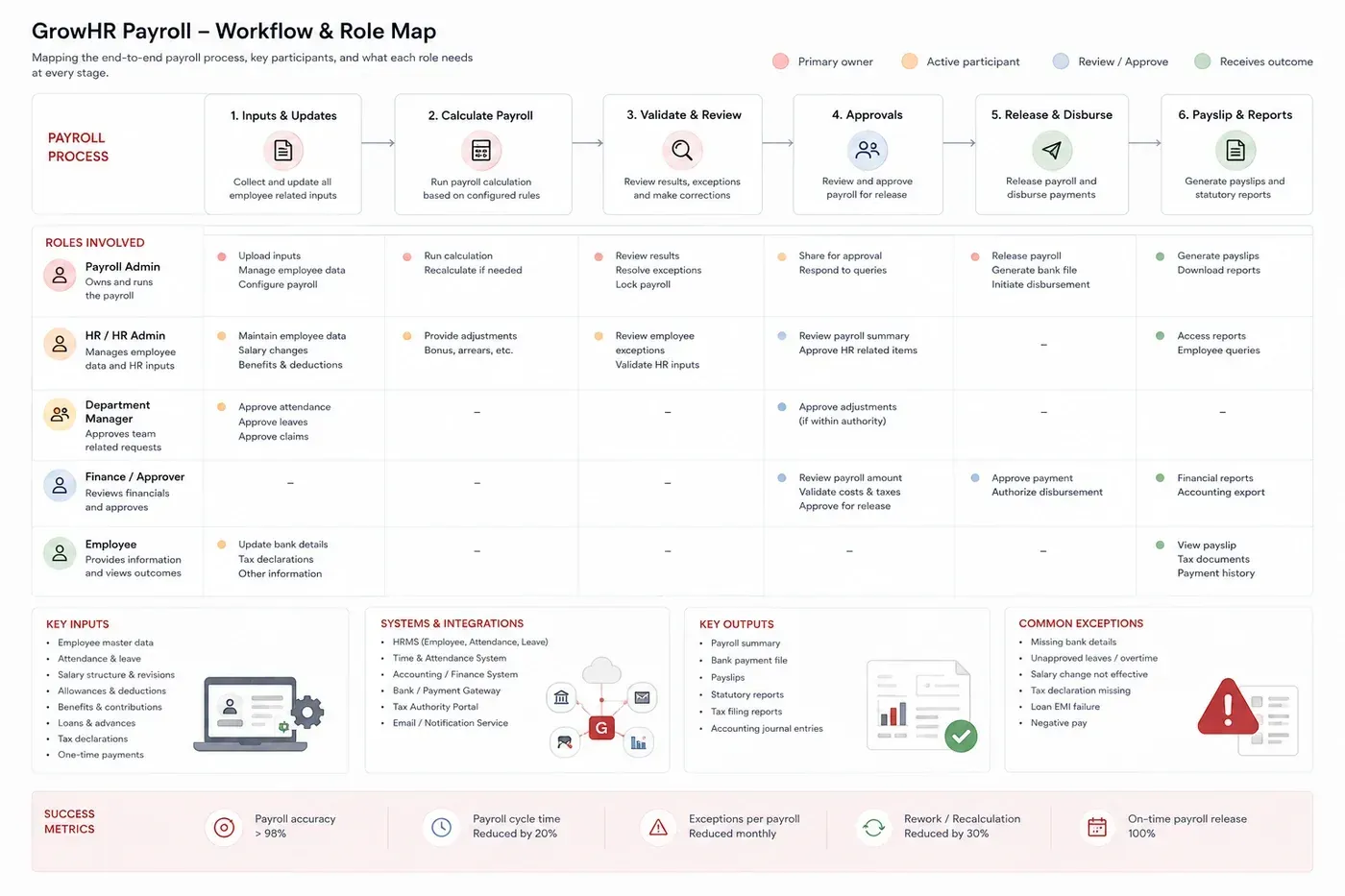
Drawing it settled two things. The Payroll Admin owns an outcome that depends on people outside their control: managers approving attendance and leave, HR maintaining salary changes, Finance approving the amount, employees keeping their own bank details current.
And the further right you move along that process, the more expensive a missing input becomes. A bank detail missing at stage one is administration. The same detail missing at stage five is a payment that does not arrive. That is the argument for surfacing exceptions early, and for making approval status something a Payroll Admin can see rather than chase.
What the redesign was aiming at
Before auditing anything, we agreed what a better payroll experience would actually do. Naming the targets first is what kept the audit from becoming a list of things we happened to dislike.
> 98%
payroll accuracy
20%
reduction in payroll cycle time
100%
on-time payroll release
Two more sat alongside them and resist a single number: fewer exceptions in each payroll run, and roughly a third less rework once a payroll has been calculated. Both matter for the same reason. They are the difference between a cycle that closes on time and one that has to be run again.
Where the existing experience broke down
Before changing the interface, we needed to understand where the existing experience was creating friction, and to separate what we could observe from what we would go on to recommend.
- Payroll workflow
- Information hierarchy
- Navigation
- Terminology
- Exceptions
- Actions
- Accessibility
- Competitive patterns
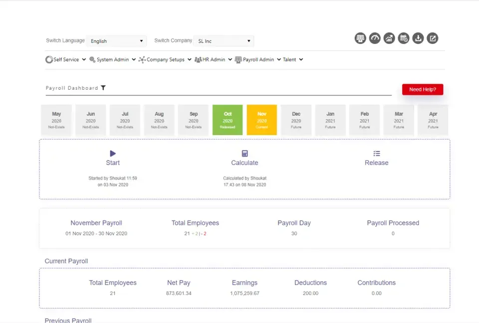
The screen consolidated most of the payroll process into one place. That kept everything together, which is genuinely useful, and it is why the screen had survived as long as it had. It also left three questions hard to answer: what stage is this payroll in, what needs attention, and what should happen next.
The problem was not a lack of information. It was a lack of structure.
Where payroll gets blocked
Payroll rarely fails because a calculation is wrong. It fails because something upstream never arrived.
- Missing employee information
- Pending approvals
- Attendance or leave issues
- Salary changes not yet effective
- Policy changes
- System configuration
- Missing or invalid banking information
A payroll system therefore needs to make failure actionable. Knowing that something is wrong is only useful if the Payroll Admin can also see what went wrong, how many people it affects, who has to resolve it, and what it is holding up. The legacy screen surfaced none of that as part of the workflow, which is why exception handling became one of the largest pieces of the redesign.
Five findings that mattered
Rather than reproduce a heuristic checklist, these are the findings that actually changed the design. The middle column is what we observed. The right-hand column is what we proposed, which is a different kind of claim.
| Finding | What we observed | What we recommended |
|---|---|---|
| Payroll state was unclear | Start, Calculate and Release were exposed as controls, but the state of the run itself was never stated | Introduce explicit workflow states |
| System vocabulary on the surface | Months with no payroll configured were labelled “Not-Exists”, a database state promoted to a label | Name states for what they mean to the reader |
| Navigation gave no context | Six administrative categories sat side by side, so where the payroll dashboard belonged was unclear | Group payroll tasks into an area of their own |
| Employee detail was out of reach | The screen showed employee counts but offered no way to inspect an individual payroll record | Add employee-level drill-down and a dedicated Employees section |
| Exceptions were invisible | Issues were not presented as part of the payroll workflow at all | Introduce Outstanding Items ahead of each stage |
The first recommendation is the one everything else hangs from. A payroll run has a state, and the interface simply never said what it was.
- Not started
- In progress
- Review
- Approved
- Released

Accessibility
We ran the legacy screen against WCAG 2.1 AA. Eleven findings, and most of them traced back to two systemic causes rather than eleven separate mistakes.
4
findings
5
findings
2
findings
Under-contrasted secondary text
Grey was carrying a lot of the interface: the timestamps under Start and Calculate, the year on every month tile, the Not-Exists labels, the second line in each payroll panel. Much of it fell below the 4.5:1 requirement.
Status communicated through colour alone
Current and Released were separated largely by fill colour, which makes them hard to tell apart with a colour vision deficiency. The same pattern appeared in the employee deltas.
- Darken the muted grey token to around #616161 or darker on white
- Give every status a redundant cue: an icon, a label, a border or a pattern
- Verify minimum touch targets of 44 by 44px
- Give every interactive element a visible keyboard focus state
- Give payroll period tiles accessible names carrying month, year and status
How other products handle it
We looked at how other payroll products structure the same workflow. The aim was to understand patterns, not to borrow visual designs. Products reviewed were Zoho Payroll, Keka, RazorpayX Payroll, BambooHR and Workday.
| Capability | GrowHR | Keka | RazorpayX | Other benchmarks |
|---|---|---|---|---|
| Payroll status | Basic | Strong | Strong | Varies |
| Processing workflow | Basic | Strong | Strong | Strong |
| Exception handling | Limited | Strong | Strong | Varies |
| Approval visibility | Limited | Strong | Strong | Strong |
| Employee-level detail | Limited | Strong | Varies | Varies |
| Payroll analytics | Limited | Strong | Strong | Strong |
Where a competitor’s payroll workflow was not publicly documented, the rating reflects what their demonstrations and published material showed us, not a full account of the product. Several of these ratings would move with better access.
The conclusion held regardless. GrowHR’s dashboard was largely status oriented: it showed where payroll had got to, but gave the Payroll Admin little visibility into exceptions, employee-level detail or approval dependencies. Keka was the clearest reference for guided processing and exception handling, and RazorpayX for approval visibility.
Walking the tasks ourselves
With no access to Payroll Admins, we did the next most useful thing: assigned the core payroll tasks to members of the team, had each of them attempt the task in the legacy product, and recorded where they stalled.
This is worth naming honestly. It surfaces interface problems reliably and domain problems poorly, because none of us carried a real Payroll Admin’s expectations into the task. It tells you where a screen is confusing. It does not tell you whether the workflow behind it is right.
| Task | Where it happens today | What breaks down |
|---|---|---|
| Select payroll period | Timeline of month tiles | Status is difficult to interpret |
| Start payroll | Start action | Prerequisites are never stated |
| Calculate payroll | Calculate action | Its relationship to Start is unclear |
| Check employees | Employee count | No way to drill into a record |
| Identify exceptions | Nowhere in particular | No exception management exists |
| Release payroll | Release action | Consequences are not spelled out |
| Check previous payroll | Previous Payroll panel | Requires scrolling, weak hierarchy |
Choosing what to fix
We could not solve every problem at once. Payroll was one part of a much larger HRMS with its own roadmap and its own delivery pressure, so the effort had to go where it most affected whether a payroll run actually completed.
| Area | Finding | Evidence | Severity | Recommendation |
|---|---|---|---|---|
| Payroll status | Current state unclear | State must be inferred from controls | High | Introduce explicit workflow states |
| Payroll periods | Status hierarchy is weak | Current, pending and future look alike | High | Redesign period navigation |
| Exceptions | No exception management | Issues are never surfaced | High | Introduce Outstanding Items |
| Navigation | Too many admin categories | High cognitive load to locate payroll | High | Group payroll tasks together |
| Actions | Start, Calculate and Release lack context | Dependencies between them are unclear | High | Make workflow state explicit |
| Terminology | “Not-Exists” is unclear | System vocabulary on the surface | Medium | Use language that describes meaning |
| Visual hierarchy | Key metrics lack emphasis | Everything shares a visual weight | Medium | Establish a stronger hierarchy |
| Typography | Secondary text is small and light | Reduced readability | Medium | Improve type scale and contrast |
The five High rows became the redesign. Everything below them was real, but it was work for the design system rather than a reason to rethink a screen.
From system structure to task structure
The existing navigation described how the product had been built. Six administrative categories sat across the top, and the payroll dashboard lived somewhere inside one of them.
- Self Service
- System Admin
- Company Setups
- HR Admin
- Payroll Admin
- Talent
That structure left a Payroll Admin holding several questions at once. Where am I? Which role am I currently acting as? Is the payroll dashboard a module or a report? What is the relationship between the Payroll Admin category and the payroll dashboard sitting inside it?
None of those questions are about payroll. They are overhead the interface charges before the work begins.
The proposed structure gives payroll its own area, with one task per entry. The product labels the first of them Home, and it is the dashboard the case study opens with.
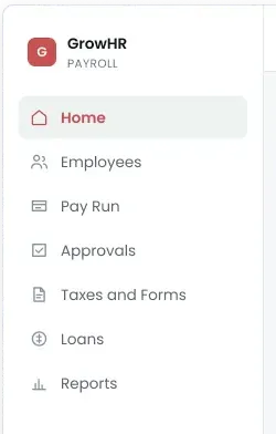
We deliberately kept the change focused. The objective was to give payroll a clear task model, not to reorganise an HRMS that existing customers had already built processes around. A wider information architecture change would have been easy to draw and expensive to migrate, and migration cost falls on the customer rather than on the designer.
Four principles
Make the current state obvious
Someone arriving mid-cycle should see where the payroll has got to without opening anything.
Surface exceptions before they block
Problems should be visible and actionable while there is still time, not discovered at approval or release.
Separate monitoring from execution
The Dashboard helps a Payroll Admin understand payroll. Pay Run helps them process it. One screen doing both is what made the legacy experience hard to read.
Structure complexity rather than remove it
Enterprise payroll is genuinely complicated. The job is to make that complexity navigable, not to hide parts of it.
Monitoring, and execution
The audit pointed at one structural decision. Instead of consolidating the whole payroll workflow into a single screen, we split the experience by what the Payroll Admin needs at each point: a place to understand payroll, a place to work on the people in it, and a place to run it.
An earlier pass
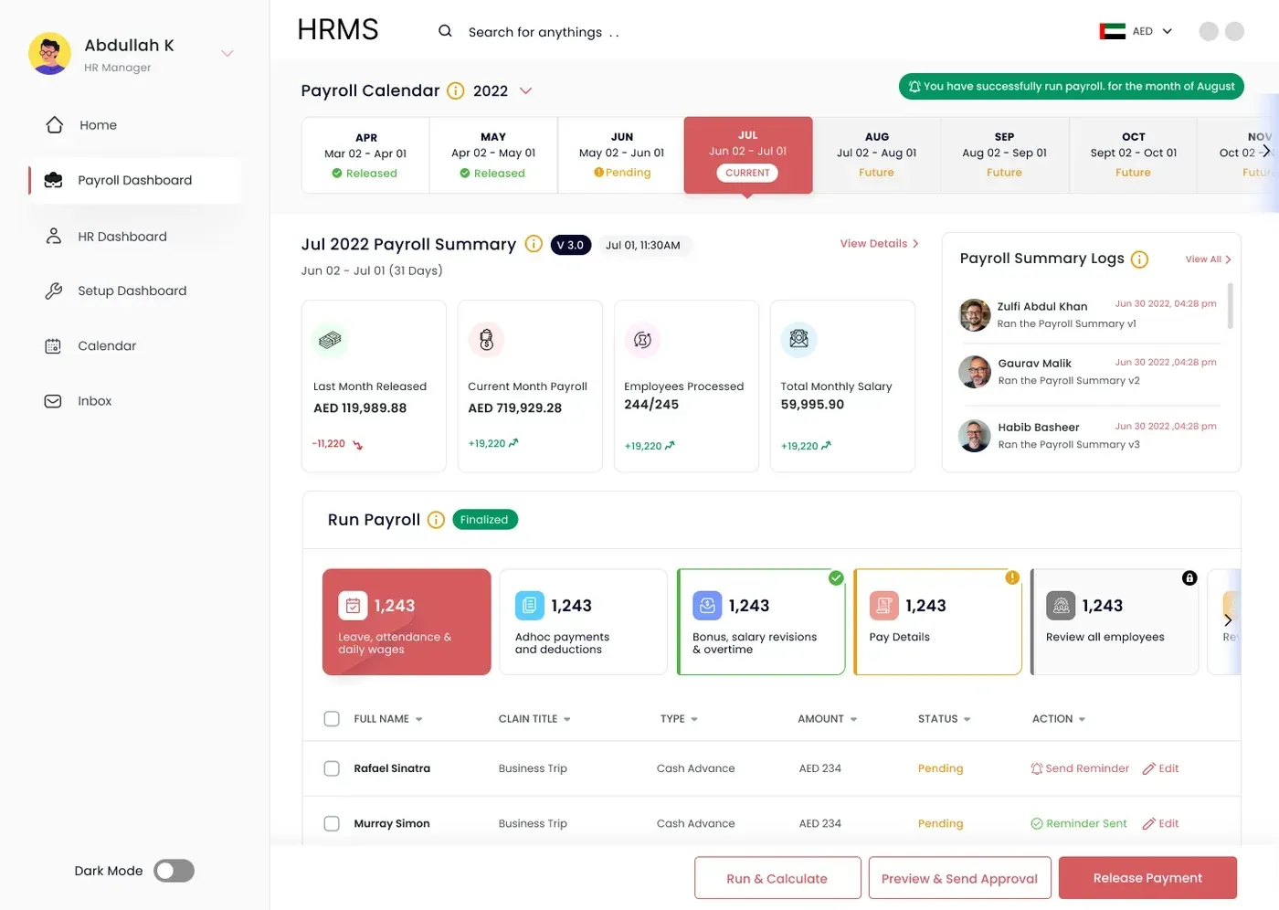
Before the architecture work, we had already redesigned the dashboard once, and it was a real improvement. The payroll calendar carried a status per period. The processing operations became visible stages rather than scattered destinations. The three payroll actions were ranked and moved below the evidence for using them.
It also kept the original premise. Everything still lived on one screen, the surrounding navigation was untouched, and exceptions still had nowhere to live. Reading this pass back against the audit is what produced the third design principle, and it is the reason the final design has a Pay Run at all.
Dashboard

The dashboard became the monitoring layer. It answers how the current payroll is doing and whether anything needs attention, then hands off to the screen where the work happens.
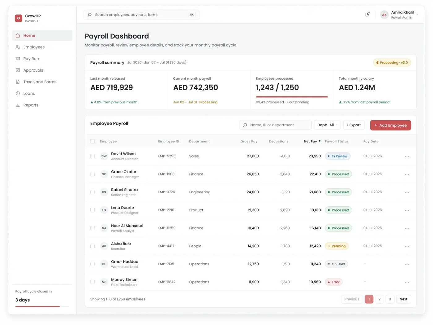
Two details do most of the lifting. Employees processed reads as a count against a total, 1,243 of 1,250, with the seven outstanding stated underneath, so an incomplete run is visible without opening anything. And each figure carries its movement against the previous period in the same place, which means comparing this month to last is part of reading the number rather than a separate panel further down.
Below the summary sits an employee table, which is the drill-down the legacy screen never offered.
Employees
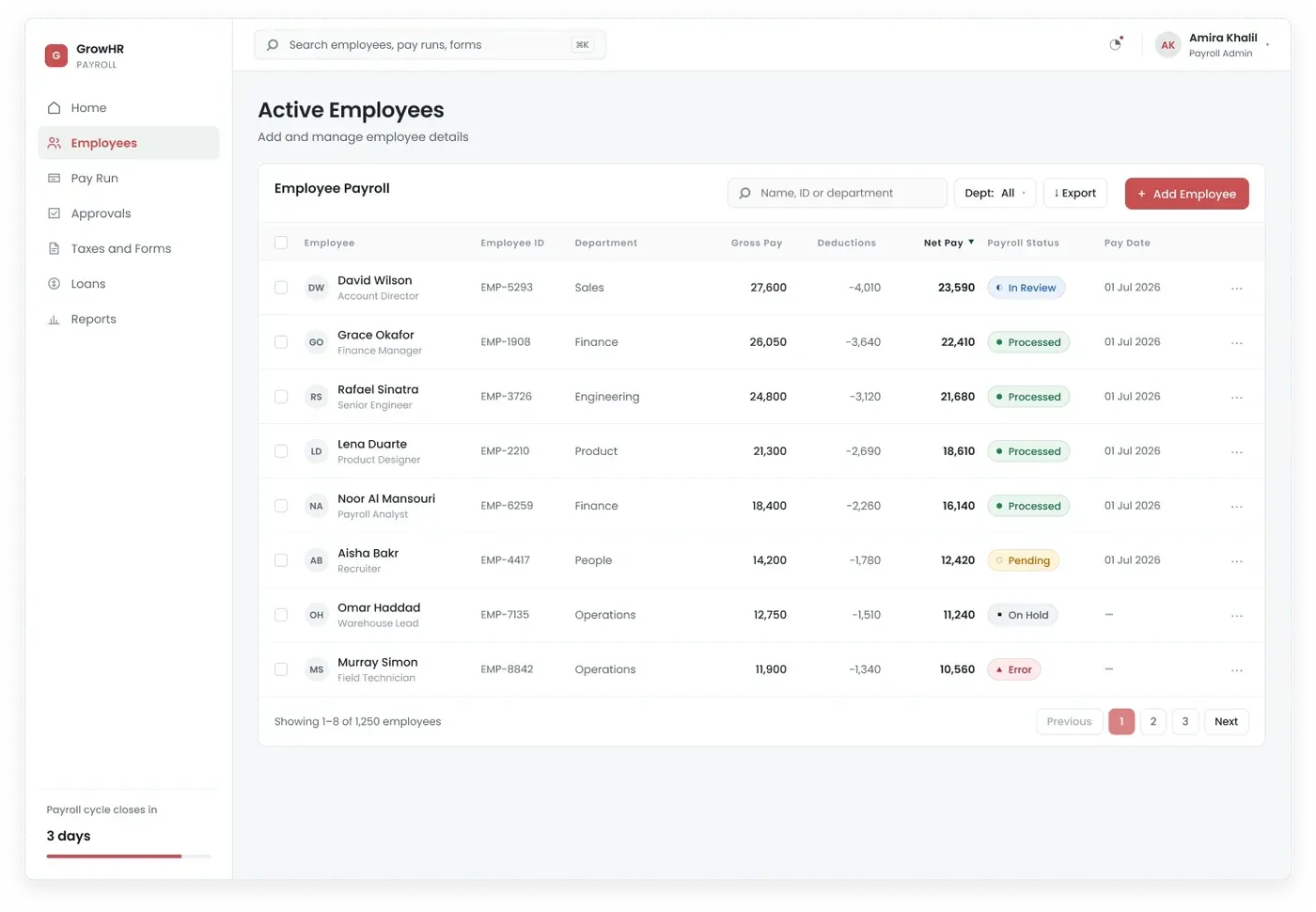
Employee information earned a workspace of its own rather than being buried inside the payroll dashboard. Search, department filters, an add employee action, and one row per person carrying gross pay, deductions, net pay, payroll status and pay date.
The status column is the point. In Review, Processed, Pending, On Hold and Error all appear in the same list, so working out who needs attention during a run becomes a scan rather than an investigation.
Pay Run
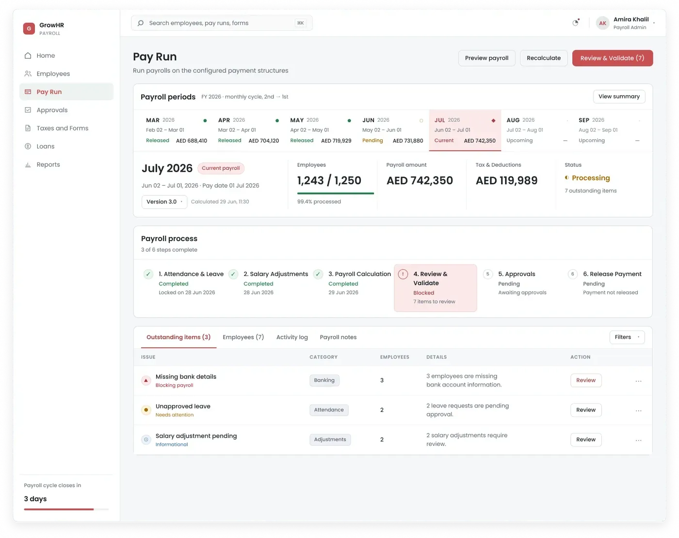
Pay Run is where payroll execution happens, so the screen had to communicate two things the legacy product never did: progress, and responsibility.

Each period carries its date range, its status and its amount. Released, pending, current and upcoming are distinguishable by label as well as by colour, which closes one of the accessibility findings. Comparing this month against the last three became a glance across a row rather than a scroll to a panel.

The six steps are stated as a sequence, with the current one marked and each of the others carrying its own state.
- Attendance & Leave
- Salary Adjustments
- Payroll Calculation
- Review & Validate
- Approvals
- Release Payment
This is the single change that answers what should I do next without the Payroll Admin having to work it out. A completed step carries its date. A blocked step carries its count. A pending step says what it is waiting on.
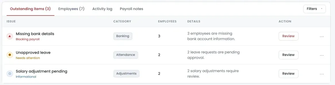
Each issue states what went wrong, how many employees it affects, its category, and the action available. Missing bank details is marked as blocking payroll. Unapproved leave needs attention. A pending salary adjustment is informational. Severity reads through an icon and a label rather than colour alone, which was the other systemic accessibility finding.

The count in that last button is small and does a surprising amount of work. The action now tells the Payroll Admin not only what they can do, but what remains before they can proceed.
Structure, not subtraction
- Navigation
- Six administrative categories with payroll somewhere inside.
- Seven payroll areas, one task each.
- Payroll state
- Inferred from controls and timestamps.
- An explicit step in a six-step process.
- Exceptions
- Not present on the screen at all.
- Outstanding Items, with owner, count and action.
- Employee detail
- A count.
- A searchable list with per-person payroll status.
- Comparison
- A Previous Payroll panel further down the page.
- Movement attached to each figure, periods side by side.
- Primary actions
- Above the evidence, unranked.
- After the evidence, ranked, carrying what is outstanding.
- Terminology
- System states such as Not-Exists.
- Labels that describe what the state means.
Redesigning an enterprise product is not always about removing complexity. Sometimes the opportunity is to give that complexity a structure people can understand.
Almost nothing was taken away. The legacy screen’s information survives, and most of it now appears in more places than before, not fewer. What changed is that it sits in an order that matches the work: understand the payroll, process it, verify it, get it approved, release it.
The shift was from a screen arranged around the system to an experience arranged around the task.
What I would do differently
I worked from the requirements document, the existing interface, competitor exploration and internal workflow analysis. What I would do differently is spend a month end sitting with a Payroll Admin.
A live cycle exposes what a documented process hides: reruns, corrections, late joiners, changes made after calculation, information that arrives at the wrong moment, approvals that stall for reasons nobody wrote down. Those are the cases a happy-path workflow absorbs badly, and they are exactly the cases payroll produces every single month.
It would have told us whether this design holds up under real operational pressure rather than against the specification. That is the difference between a workflow that is defensible and one that has been tested, and I would rather ship the second.