Making medication refills easier in the oneNUHS app
oneNUHS is the patient app for Singapore's National University Health System. This work looked at what happens after a consultation ends, when someone still has to get hold of their medication.
Understanding the healthcare journey
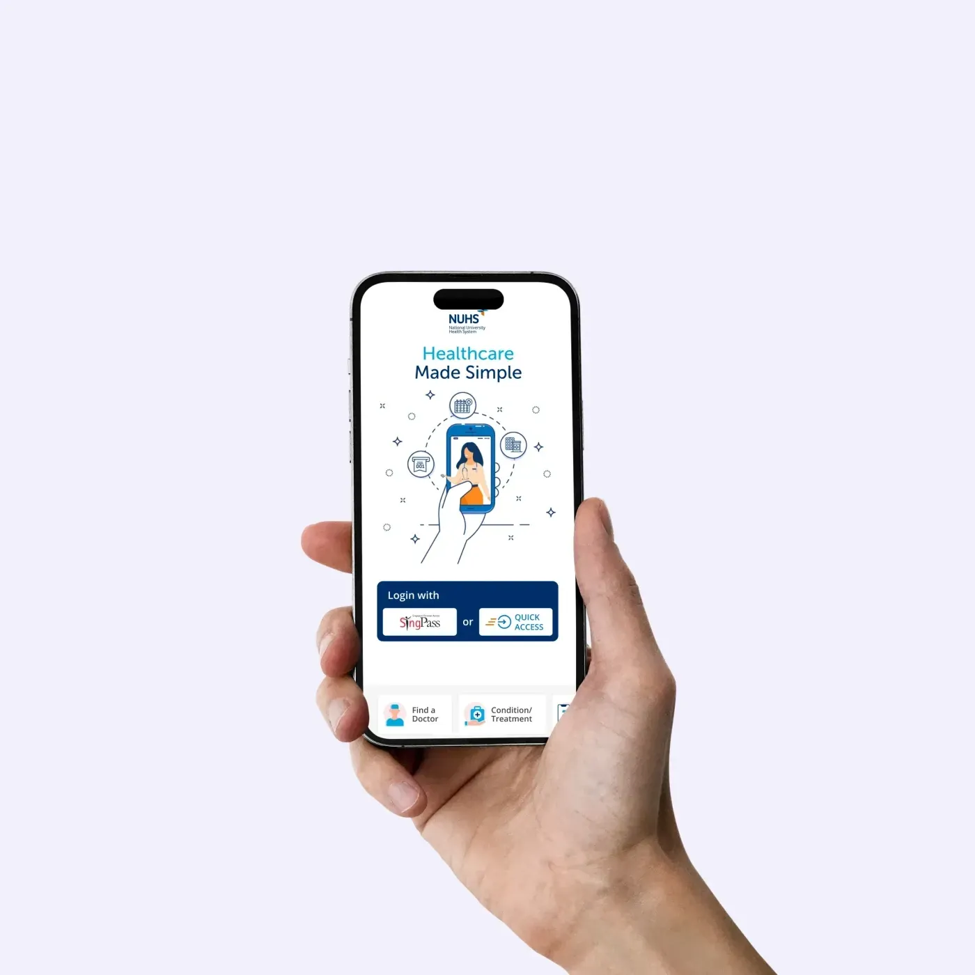
NUHS is one of Singapore’s three public healthcare clusters, running hospitals, polyclinics and national specialty centres. oneNUHS is the app it gives patients, and it arrived when COVID made a hospital the last place anyone wanted to stand around in. Appointments, TeleConsult, records and payments all moved onto a phone in a short space of time.
By 2026 the app had passed 840,000 users and a million downloads. Those numbers describe an app that people rely on. They do not describe this project, and I have kept them separate from it on purpose.
840K+
users as of 2026
1M+
downloads as of 2026
Who we spoke to
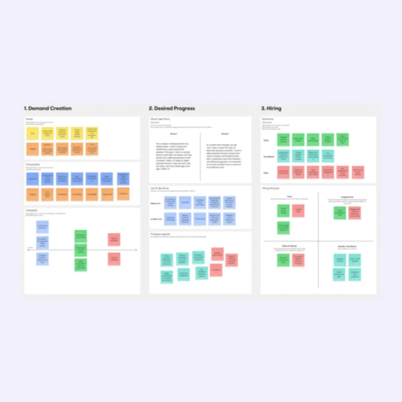
We interviewed eight to ten patients and caregivers about how they handle healthcare day to day. Not only appointments, and not only the app. The question was closer to how do you actually keep on top of all this.
Individuals
Managing their own conditions, often several at once, and often for years rather than weeks.
Parents
Running a child's healthcare alongside their own, with a different set of appointments, records and medications to keep straight.
Caregivers
Handling healthcare for someone else, usually an older parent, frequently without being in the same place at the same time.
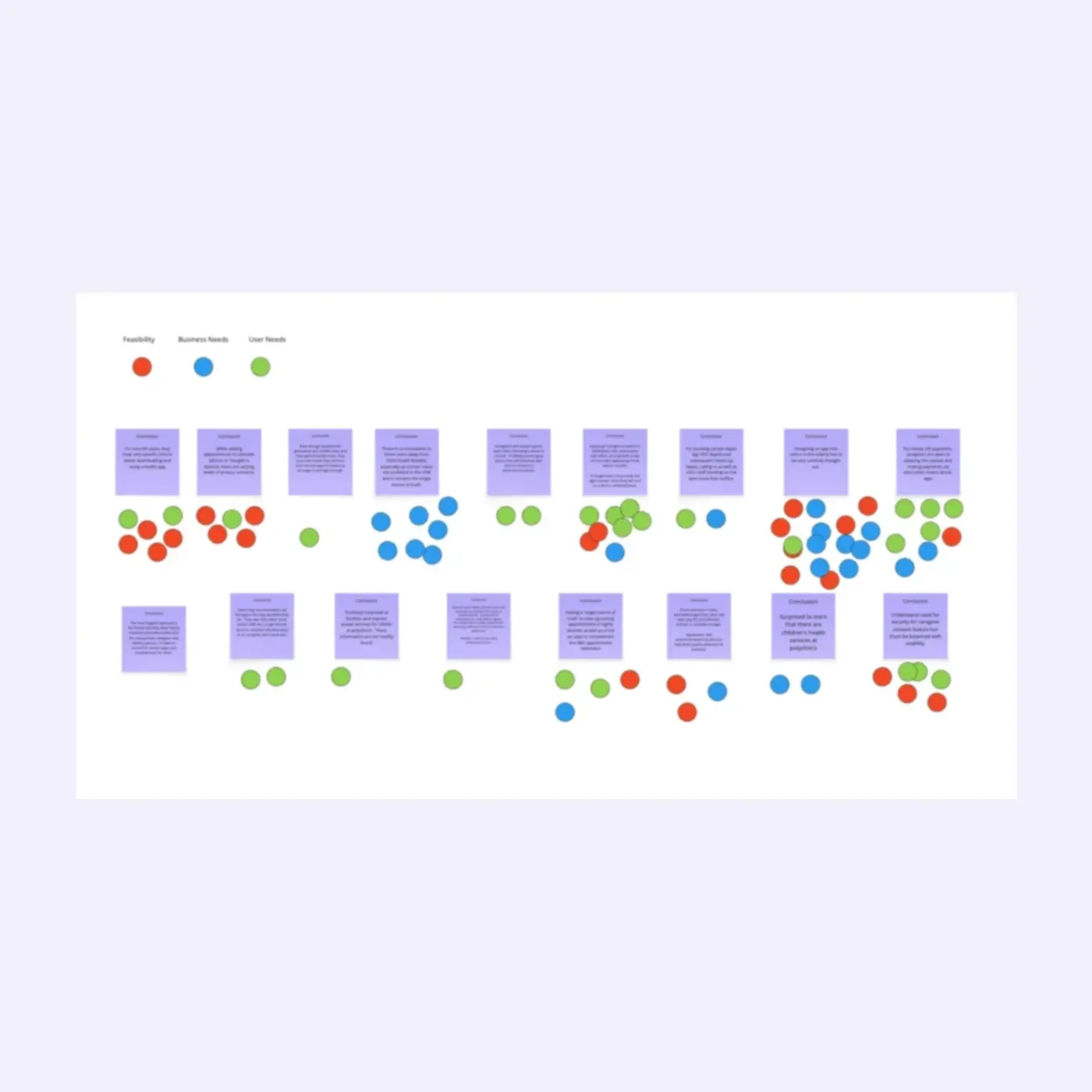
Prioritisation was a team exercise rather than a designer’s judgement call. Each conclusion was voted on through three lenses, feasibility, business needs and user needs, so the problems we carried forward were the ones that held up on all three counts at once.
Healthcare was a set of separate errands
Nobody described their healthcare as a journey. They described a list of things to do, some of them on a phone and some of them in person, with no particular relationship between them. Book an appointment here. Collect a report there. Queue at a counter for something else.
The app had already absorbed several of those errands. TeleConsult was the clearest example: a consultation that used to need a trip now happened from a sofa. But the consultation was rarely the point. The medication was the point, and the medication was still a phone call, a trip, or a form.
- Consultation
- TeleConsult from home.
- Unchanged. It already worked.
- Getting a refill
- Call the pharmacy, or go in person.
- Requested in the app, against a prescription already on file.
- The prescription
- A paper memo the patient has to find and photograph.
- Already known to the system, so nothing to find.
- Patient details
- Typed in again on every request.
- Shown for confirmation, not for entry.
- Knowing where it stands
- Wait, and call to check.
- A reference, a collection point and a notification.
People had already built their own systems
The thing that stayed with me from the interviews was how much invisible work people were already doing, and how well they were doing it.
None of that is a workaround for bad software. These are good systems, built by people who understood their own situation better than any product team would. Managing medication was never really about remembering to take it. It was about knowing what you have, knowing when you run out, and arranging the next lot before you do.
So the opportunity was not to replace what people had built. It was to take away some of the work sitting around it.
Mobility was what made that work expensive. The people with the most medication to manage are frequently the people least able to travel for it, and the caregivers arranging it are often working, or in another part of the country, or both. A refill that needs a trip is not a small ask for the people who need refills most.
How might we let someone arrange a medication refill from wherever they are, without asking them to reproduce information the health system already holds?
Redesigning the medication refill journey
The refill flow already existed. It was a five-step form.
- Particulars
- Prescription
- Quantity
- Collection
- Payment
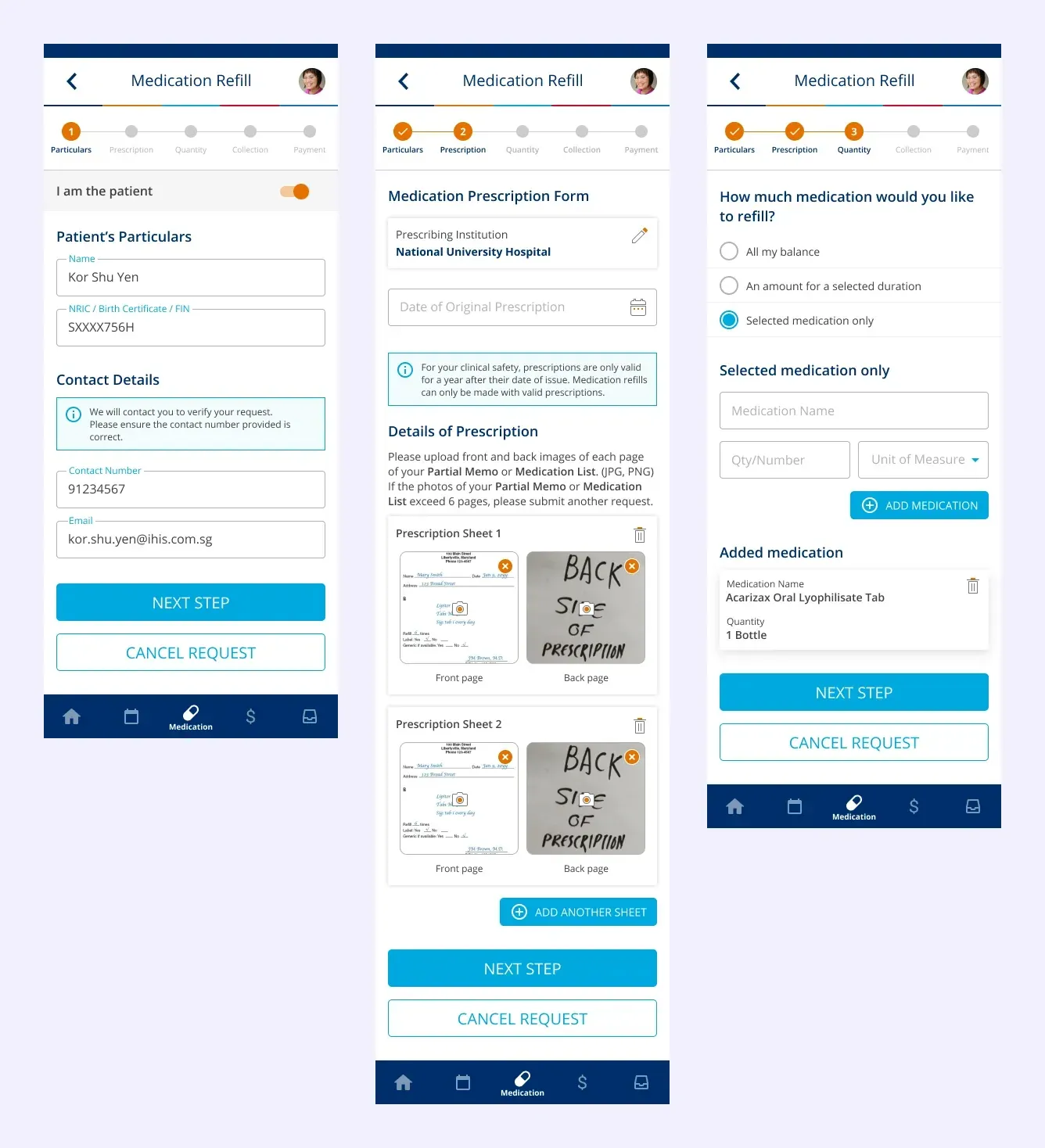
Look at what those three screens ask a signed-in patient to supply. Their name. Their NRIC. Their phone number and email. Photographs of the front and the back of every page of a paper prescription, which they first have to locate. Then the name of a medication, typed from memory or copied off a packet, with a quantity and a unit of measure.
Every one of those things is already known. The patient is signed in, so the app has their identity and their contact details. The prescription was issued by the institution the request is going to, so the system has it. The medications and their doses are on that prescription.
That single sentence removed most of the flow. What is left is not data entry. It is a set of decisions only the patient can make: which prescription, how much, where to collect it, how to pay.
- Choose a prescription
- Review and adjust
- Collect or deliver
- Pay
A simpler medication journey
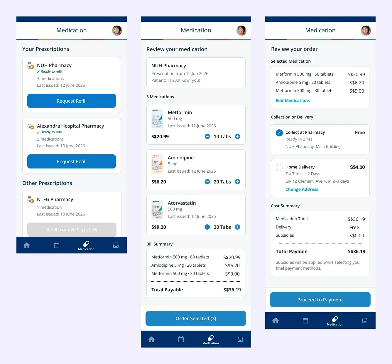
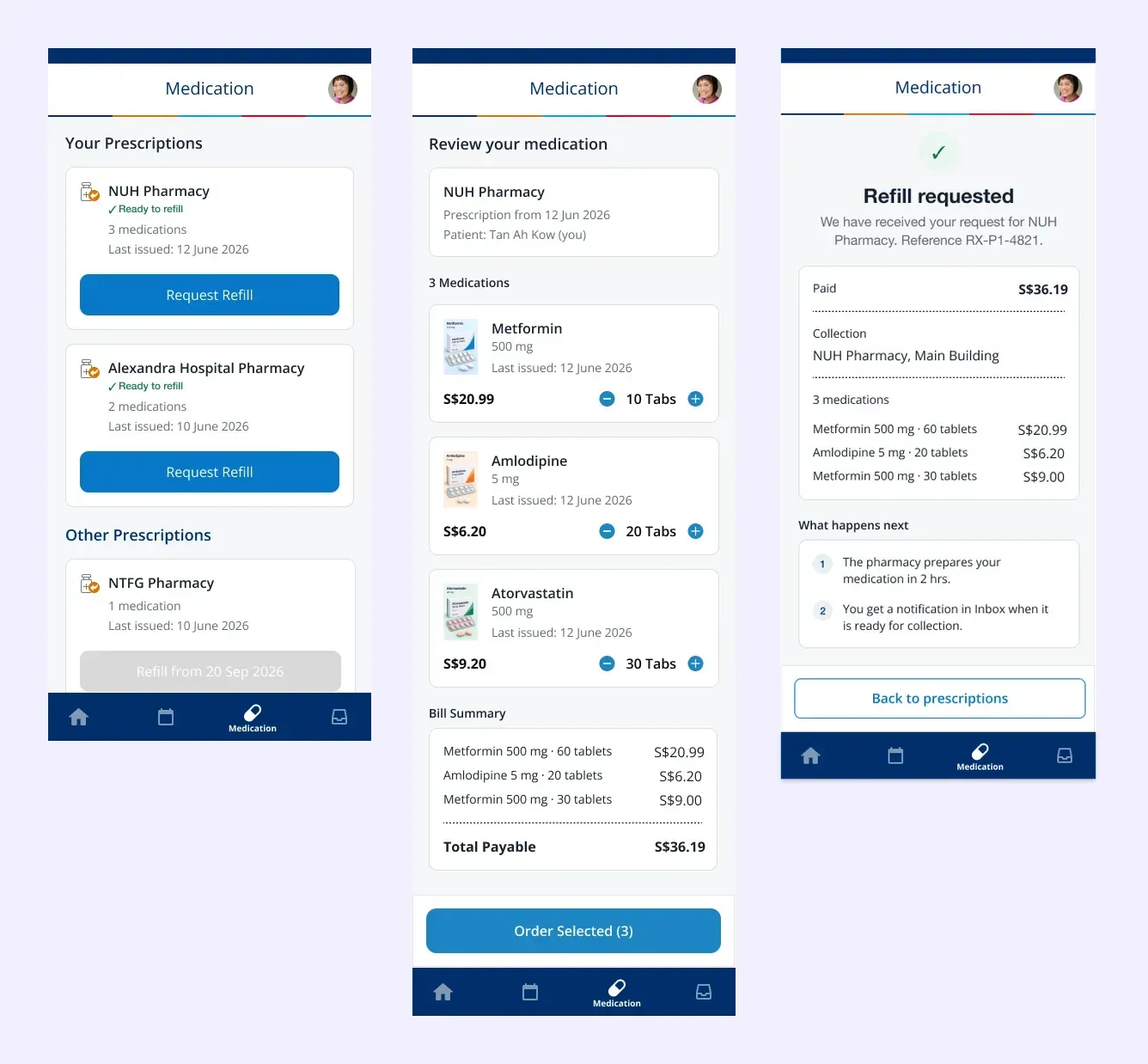
Your prescriptions. The flow opens with what the system already knows. Each prescription is grouped by the pharmacy that issued it, with the number of medications, when it was last issued, and whether it can be refilled yet. The NTFG prescription in that first screen is not eligible until September, and it says so instead of failing later.
Review your medication. The medications arrive already listed, with the dose, the date of issue and the price. There is a photograph of each one, which sounds like a small thing and is not: a caregiver who has never seen the packet can now recognise it, and so can a patient who knows the pill rather than the name.
Adjust the quantity where that is allowed. Steppers, not a text field. The patient is choosing an amount within what the prescription permits, so there is nothing to type and nothing to get wrong.
Review the cost. The bill is assembled as the order is, not revealed at the end. Medication total, delivery, subsidies, total payable.
Choose how it gets to you. Collection at the pharmacy with a ready time, or delivery to an address the app already has, with the charge stated next to it rather than discovered at checkout.
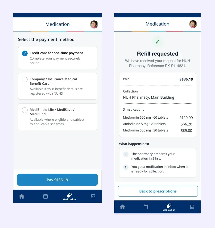
Choose how to pay. The same options a patient would have at the counter, including the schemes most people actually use, each with a line saying when it applies.
Confirmation. A reference number, the amount paid, where to collect, and two plain sentences about what happens next and how they will hear about it. The last screen of the old flow said the request had been submitted. This one says what it means.
From filling in a form to confirming a decision
The old flow treated the patient as the source of the data. Name, NRIC, contact details, a photograph of the prescription, the medication name, the quantity, the unit. Five steps of supplying things the health system had already written down.
The redesigned flow treats the patient as the person making the decisions, and treats the system as responsible for everything else.
- Pick which prescription to refill
- Check the medications are the right ones
- Adjust the quantity where the prescription allows it
- Choose collection or delivery
- Choose how to pay
Not one of those is data entry. They are choices, and every one of them needs a person.
I want to be careful about what I can claim here. This was designed, not measured. There is no post-launch study of the refill flow that I can point to, and inventing one would be worse than saying so. What I can point to is the work that came off the patient, which is countable from the screens themselves.
People had already built good systems for managing their own health, out of notebooks and pillboxes and kept packaging and family. The design job was never to replace those. It was to stop making them carry work that belonged somewhere else.
The system should carry the complexity. The patient shouldn’t have to.