Self-service that still knows when to ask for help
Woodlands Hospital wanted patients to handle routine admin themselves. The work was less about a kiosk screen than about where a machine belongs in a hospital visit, and where a person still does.
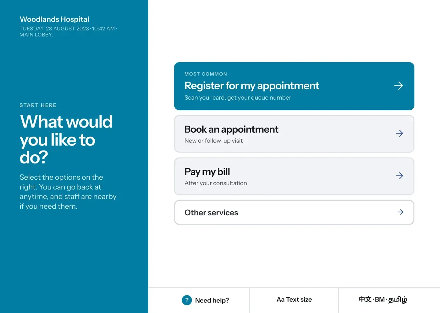
Moving routine admin off the counter
Woodlands Hospital serves the north and northwest of Singapore and is part of NHG Health. It was inaugurated in 2024, but planning for its systems started years earlier, and Synapxe was engaged to design the experience for its self-service stations.
The stations were meant to handle the tasks that fill a hospital queue and do not need a person: booking an appointment, registering for one you already have, printing a queue number, and paying a bill after a consultation.
Improve patient experience
Let people finish routine tasks on their own, with less standing about.
Reduce transaction time
Make the common tasks quicker to complete than queueing for them.
Reduce counter queues
Move the transactions that suit a machine away from staffed counters.
Improve operational efficiency
Free staff from repetitive admin so they can spend time where a person is genuinely needed.
Flatten the learning curve
Build something legible to patients who are not comfortable with technology.
A hospital kiosk is not a McDonald's kiosk
This was the framing that changed how I approached the whole project.
A fast food kiosk has one job: help someone complete a purchase. If it goes wrong, the customer orders again, or gives up and joins the queue, and nothing much is lost.
A hospital station sits inside something far more consequential. It handles patient identity, medical appointments, money, personal records. Its users may be unwell, anxious, elderly, in a wheelchair, or helping someone else through a visit they did not plan for. It depends on hardware that can fail and on backend systems it does not control.
- What it handles
- An order and a payment.
- Identity, appointments, records and money.
- Who is using it
- A customer, usually in a hurry.
- A patient, a caregiver, someone unwell or anxious.
- Cost of an error
- The wrong meal.
- The wrong patient, the wrong bill, a missed appointment.
- If it fails
- Order again, or queue.
- Find a member of staff, in a building you may not know.
- What good looks like
- Speed and convenience.
- Confidence, clarity, accessibility, then speed.
Speed still matters. It just stopped being the thing to optimise first.
Watching the stations that already exist
Singapore hospitals already ran self-service stations. Before designing anything, we went and watched them being used.
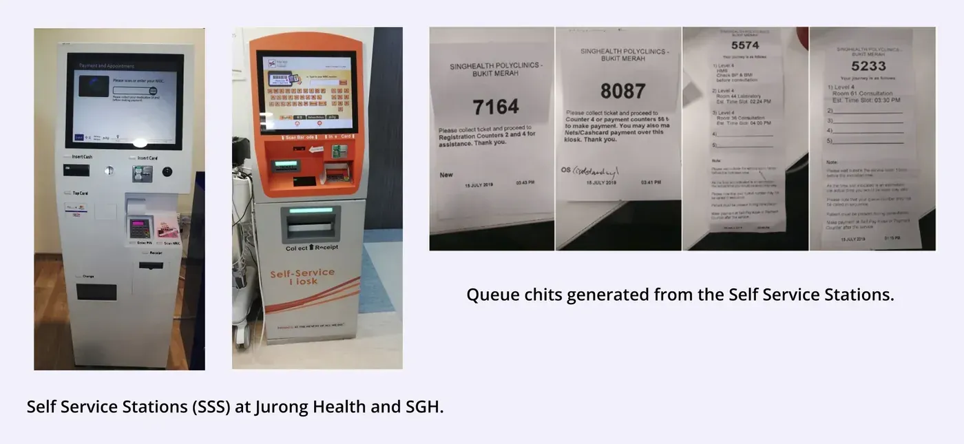
We looked at NRIC scanning, touchscreen responsiveness, how queue chits printed and what was on them, how far a person had to reach, whether a wheelchair user could use the screen at all, how people worked out where to go next, and when a member of staff had to step in.
What patients actually did
The pattern was consistent across sites. People are not loyal to the kiosk or to the counter. They pick whichever one looks faster.
| Patients use the station when | Patients avoid it when | |
|---|---|---|
| Queue | The counter is crowded | The counter is free |
| Task | They just need to register or get a queue number | They need something explained |
| Confidence | They have done it before | They are uncomfortable with technology |
| The machine | It responds immediately | It is slow, or a queue has formed at it |
The problems we watched fell into three groups, and only one of them was a software problem.
| Where it broke | What we saw |
|---|---|
| Hardware | NRIC scans failing, queue chits not printing, unresponsive touchscreens |
| Interaction | Unclear navigation, and no sense of what the next step was |
| Accessibility | Wheelchair users needing help to reach the screen, elderly users needing help to read it, and very little for visually impaired users |
The assumption the research broke
We expected elderly patients to struggle. Many of them did not.
A large share of them were frequent visitors, coming back for follow-up appointments month after month, and they had learned the existing stations by repetition. Several moved through them faster than younger patients did.
Age did not predict digital confidence. Familiarity did.
Some elderly and physically challenged patients did need help, but when we looked at why, it was rarely the interface on its own. It was reaching the screen, reading the screen, standing long enough, handling the hardware, or not knowing what came next.
What the staff told us
We interviewed staff working alongside existing stations, including at NUP and SGH. Four things came out of it.
The stations do reduce queues
Staff confirmed that self-service shortens the counter queue and the wait behind it.
Queue information is mostly understood
What gets printed on a queue chit is generally clear, though some patients still ask.
Assistance is not going away
Younger and confident users manage alone. Elderly and physically challenged patients are more likely to need someone.
Wayfinding becomes part of the job
Patients ask staff where the clinic or counter on their chit actually is. The kiosk journey does not end when the transaction does.
Self-service is not self-reliance
That last insight reframed the brief. The goal was never to remove people from the process.
The station should let independent users move faster, and make help easy to reach for everyone else.
Which is why there is a Need Help button on every screen of the final design, in the same place, including the confirmation screens.
Two journeys through the building
A kiosk screen is not the unit to design here. The unit is a patient crossing a lobby with something to sort out.
Booking an appointment
- Arrive
- Find the station
- Identify
- Choose clinic
- Choose day
- Choose time
- Review
- Confirm
- Leave with the details
The emotional shape of it runs uncertain, then curious, then focused, then reassured, then confident. The confirmation is where it either lands or falls apart, because the patient has to walk away holding four answers: when is it, who am I seeing, where do I go, and what do I do when I get there.
Paying a bill
- Finish consultation
- Find the station
- Identify
- Retrieve bill
- Review bill
- Choose payment
- Pay
- Confirmation
This one runs uncertain, concerned, focused, anxious, relieved, reassured. Paying in a hospital asks more of a patient’s trust than paying in a shop. They need to be sure that this is the right bill, that it belongs to the right person, that the amount is what it should be, and that the payment actually went through.
The problem, stated plainly
Patients rely on hospital staff for routine administrative tasks such as booking appointments and paying bills. That builds queues, adds to staff workload, and puts friction into a visit that is rarely anyone’s idea of a good day.
A self-service station can move those tasks from the service desk to the patient. But unlike a retail kiosk, the people using it may be anxious, elderly, unfamiliar with how hospitals work, or have accessibility needs, and the information they are handling is personal enough that mistakes matter.
How might we make self-service feel like a seamless part of the patient’s hospital journey?
Six principles
Confidence over speed
Remove steps that add nothing. Keep the ones that let someone check what they are about to do.
Prevent errors before they happen
Healthcare transactions need stronger validation and clearer confirmation than retail ones.
Design for accessibility from the start
Elderly patients, wheelchair users, visually impaired users, caregivers, and every level of digital confidence in between.
Make the next step obvious
The screen should always answer what happens now, including after the transaction is over.
Self-service with human support
A clear route to a member of staff on every screen, not buried behind a menu.
Design for the physical thing
The interface has to work with the hardware it is bolted to: the screen height, the scanner, the printer, the payment terminal.
From flows to experience
The first information architecture had everything in it.
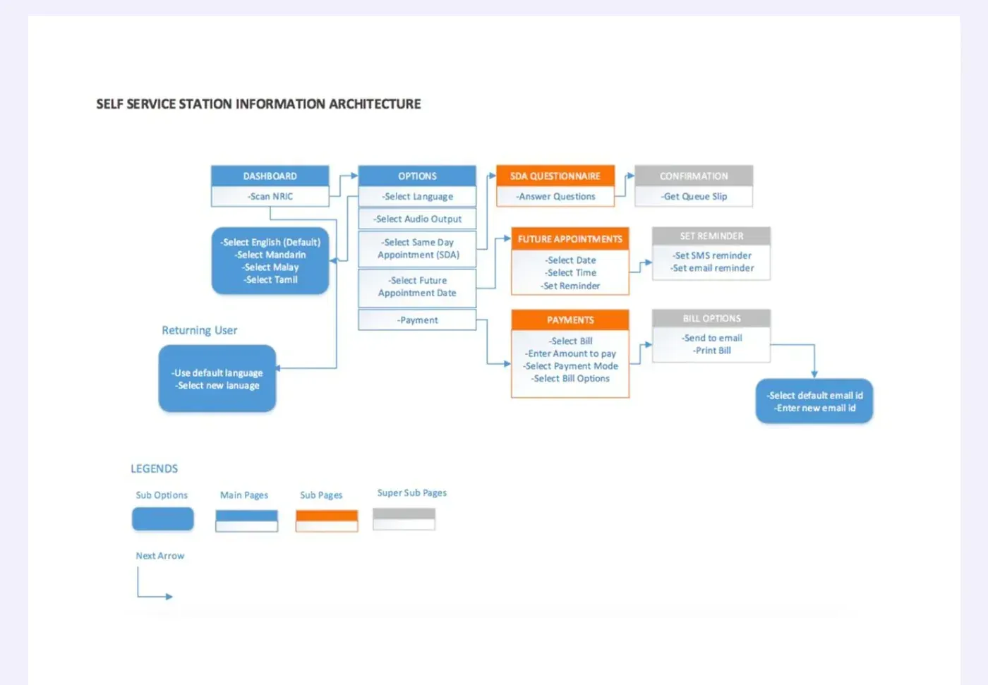
Read it as a patient rather than as a diagram. Before you get near your appointment you have chosen a language, chosen an audio output, and worked out whether what you want is a same day appointment, a future appointment or a payment. Some of those are real choices. Most are the system asking you to classify yourself before it will help.
So the work became subtraction, without losing the moments that build trust.
- Understand
- Map
- Simplify
- Prototype
- Test
- Refine
Three changes did most of it. The landing screen leads with the single most common task instead of presenting four peers. Language, text size and help moved to a persistent bar, so they are always available and never a step. And identification moved to the point where it is actually needed, rather than acting as a gate on the front door.
Three journeys, one station
Three tasks, one machine, and a set of decisions that repeat across all of them. What follows is the finished design with the reasoning attached, rather than a gallery of it.
Registering for an appointment you already have
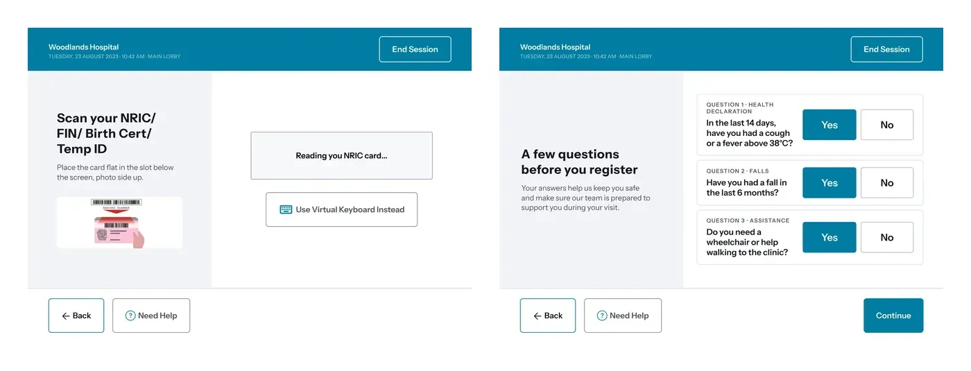
The scan screen shows the card going into the slot, because the hardest part of a kiosk is often the physical bit, not the software. When the scanner fails, and it does, the virtual keyboard is offered on the same screen rather than after an error.
The three questions are not paperwork. A recent fall or a request for a wheelchair changes how the hospital receives that patient, so they are asked before the queue number is issued rather than discovered at the clinic.
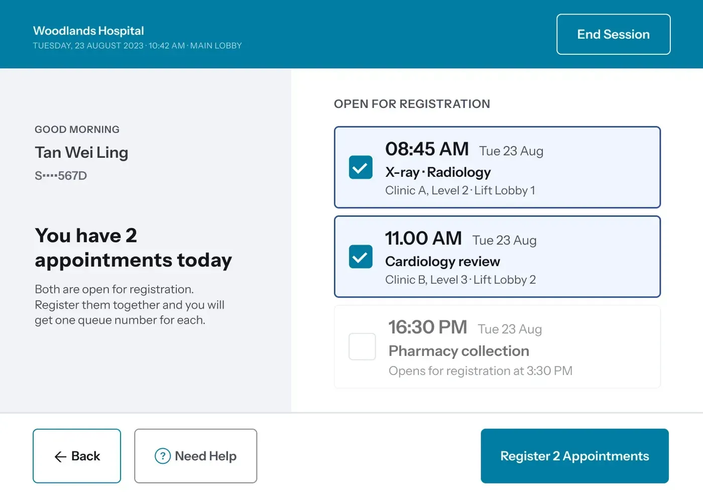
Patients frequently have more than one appointment in a day. The old model made that two separate transactions. Here both are registered at once, and the pharmacy collection that is not open yet is still listed, greyed, with the time it opens. Showing an unavailable thing and saying why beats hiding it and letting someone wonder.
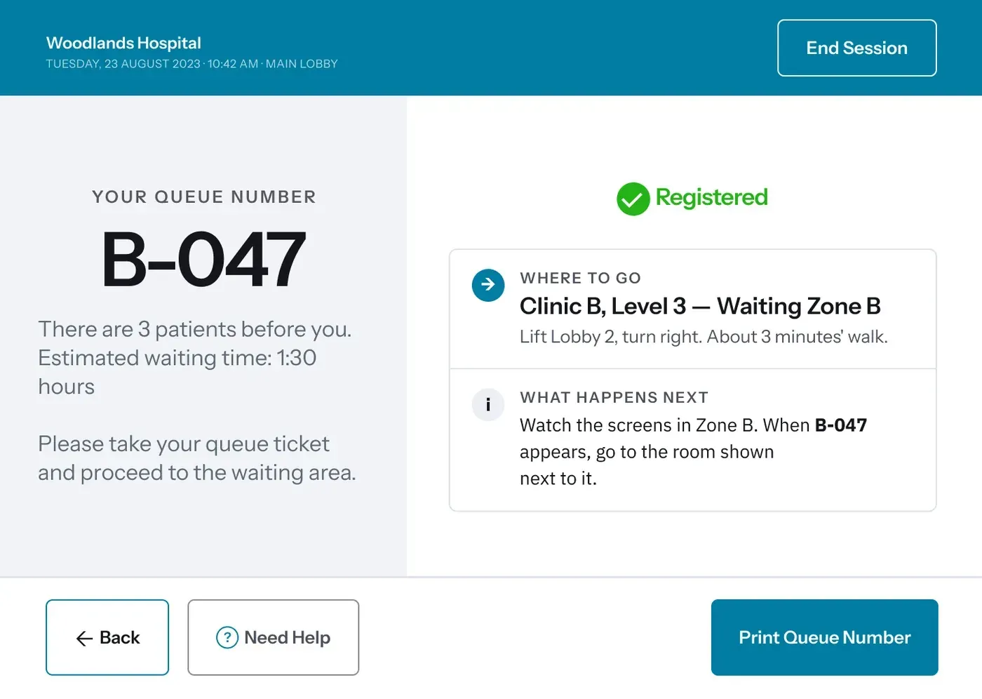
This screen is the answer to the staff insight about wayfinding. The queue number is the largest thing on it, but the rest of the screen is the part patients were asking staff about: where the zone is, how long the walk takes, and how they will know when it is their turn.
Booking a new appointment
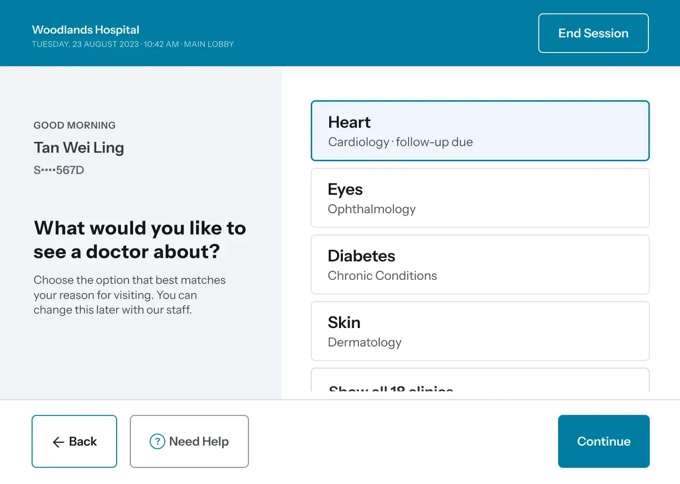
Patients do not arrive thinking in specialties. They arrive thinking about a part of their body. So the list leads with Heart and puts Cardiology underneath it, and because this patient has a cardiology follow-up due, that option is at the top and says so. Eighteen clinics exist. Four are shown.
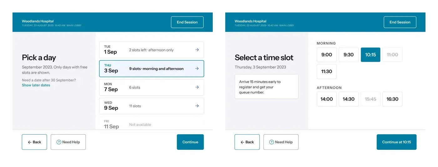
Both screens show what is not available as well as what is. A struck through 11:00 tells a patient the slot existed and has gone, which is different information from it never having been there.
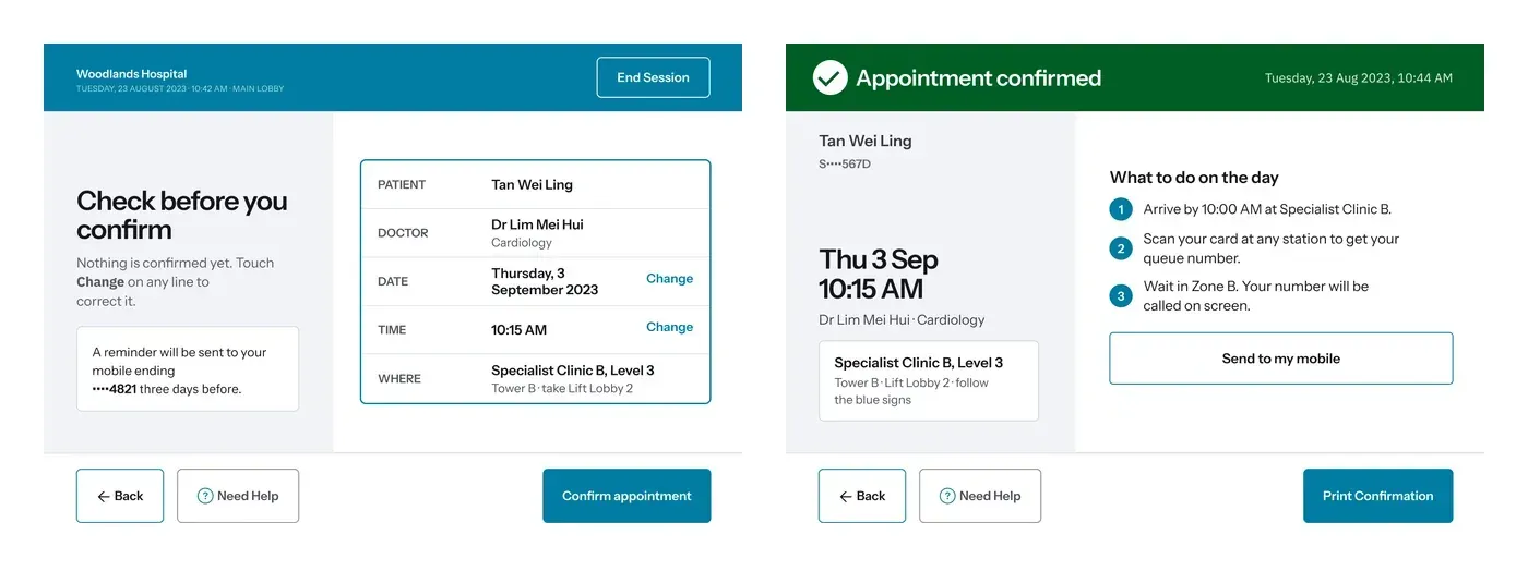
The review screen says “Nothing is confirmed yet” out loud, and puts Change next to the two fields people get wrong. That sentence exists because confirmation screens in this setting are frequently read by someone who is not certain what they have just done.
The confirmed screen answers the four questions from the journey map: when, who, where, and what to do on the day. Send to my mobile is there because a printed slip gets lost between now and September.
Paying a bill
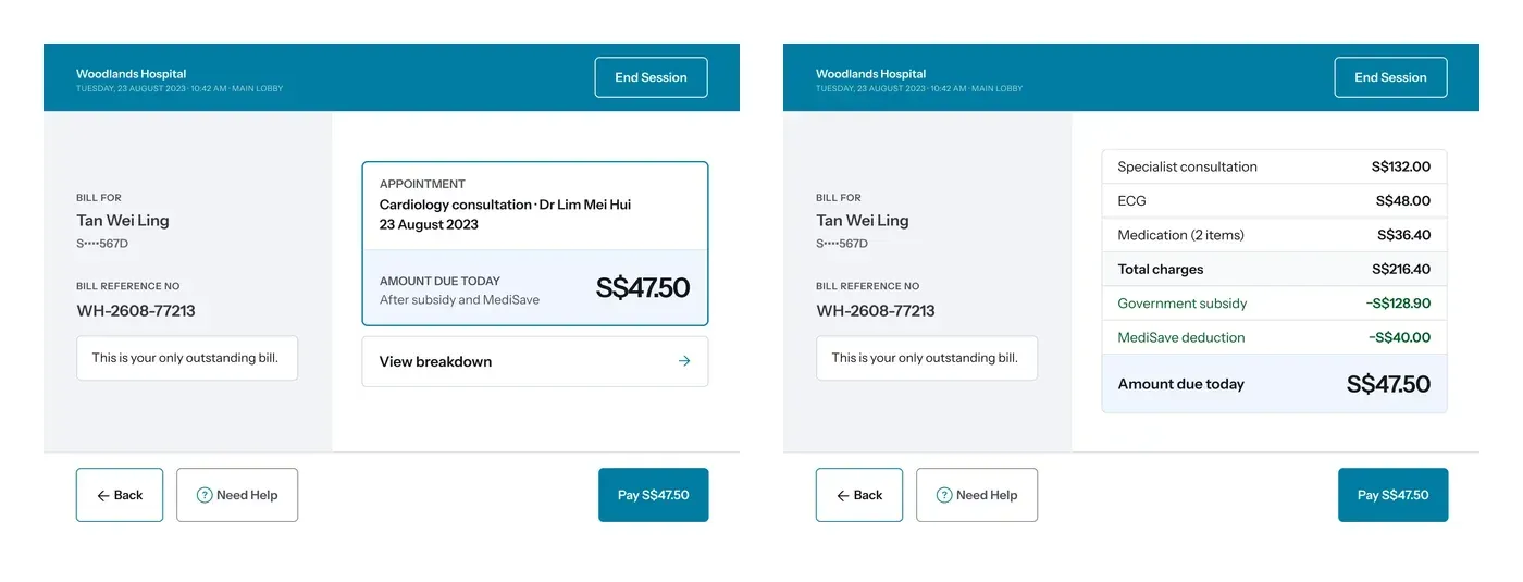
Both screens name the patient and the bill reference, because the first question at a payment kiosk is whether this is even your bill. The summary leads with what is owed today. The breakdown shows how a charge of S$216.40 becomes S$47.50 through subsidy and MediSave, in that order, so the number is arrived at rather than announced.
Only one outstanding bill exists here, and the screen says so. That single line removes the worry that something else is waiting.
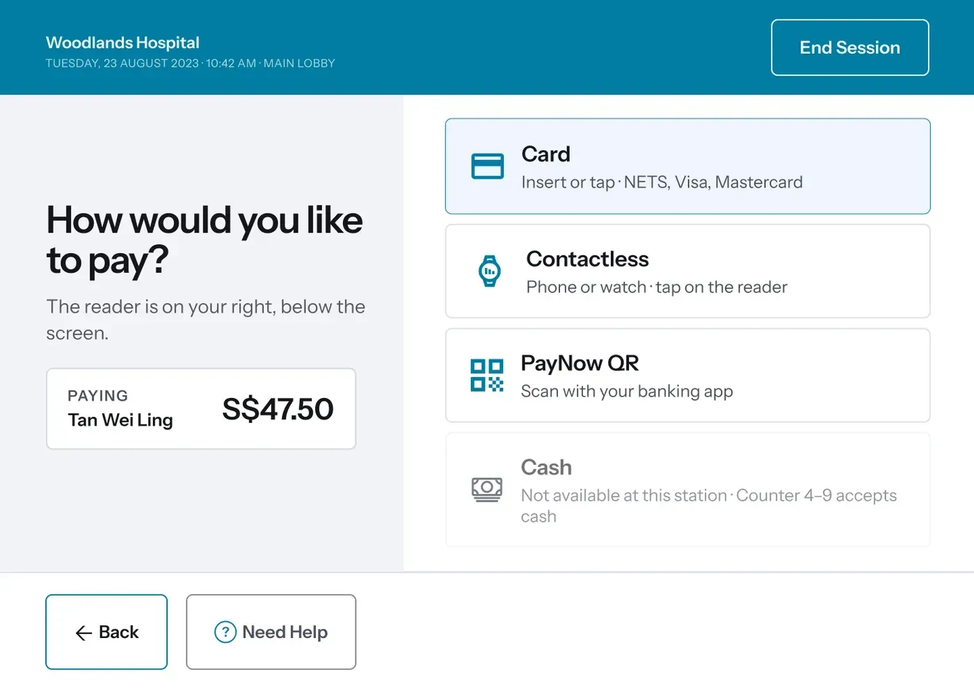
Two decisions here. The amount and the payer stay visible while the method is chosen, so nobody is picking a payment method for a number they can no longer see. And cash, which this station does not take, is listed anyway, greyed, naming the counters that do. A patient carrying only cash learns that here rather than after three more taps.
Each method also says where the hardware is: the reader is on your right, below the screen. Software describing physical objects, because the physical object is the part that stalls people.
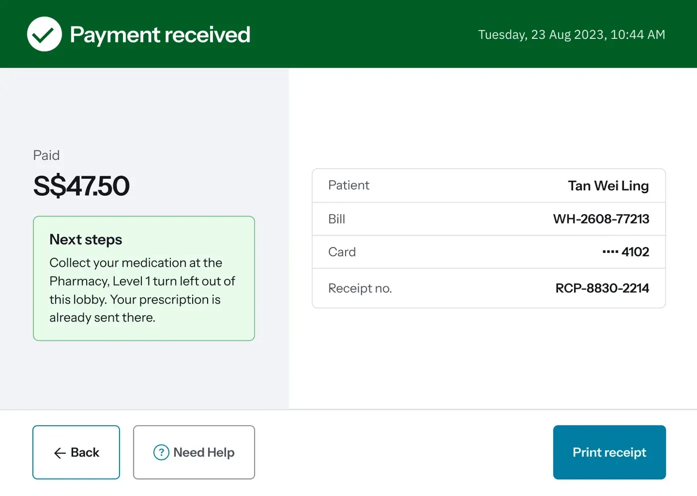
The receipt details are on the right for anyone who wants them. The left is the part that matters more, which is that the visit is not over and the pharmacy is on Level 1, and the prescription is already waiting.
Designing for a thing bolted to the floor
A kiosk is not a large phone. Almost every decision above has a physical counterpart that a mobile app never has to think about.
- Screen size and viewing angle, which set the smallest type that is readable standing up
- Screen height and physical reach, which decide whether a wheelchair user can use it unaided
- Glare in a bright lobby, which rules out low contrast entirely
- Touch accuracy for an unsteady hand, which sets the minimum size of anything tappable
- The NRIC scanner, which fails often enough that the fallback belongs on the same screen
- The card reader, QR scanner and printer, each of which the interface has to point at
What made it hard
Hardware that did not exist yet
No confirmed vendor or screen specification during the design phase, so no way to test the prototype in its real physical context.
Ergonomics across very different bodies
Screen height, viewing angle, reach and glare had to work for someone standing and someone seated, without two versions of the product.
Simplicity against completeness
The first flows had too many steps. Removing them without removing the confirmation moments that make a patient trust the transaction was the real work.
One interface, every kind of user
The same screen had to serve a confident twenty-five year old, a frequent elderly visitor, a caregiver acting for someone else, and a patient who will need staff regardless.
What this produced, and what it did not
I want to be straight about where this landed.
The design was reviewed, tested and approved by stakeholders, and then stopped before rollout on budget and procurement grounds. It did not ship.
So there are no adoption figures on this page, no queue reduction, no transaction times, and there will not be. What follows is what the design does, not what it achieved.
- A self-service experience organised around three patient tasks rather than a system menu
- Appointment and payment journeys with the unnecessary decisions taken out
- Queue and appointment information a patient can act on, including where to go and how long the walk is
- Confirmation states strong enough for a transaction people are anxious about
- Accessibility treated as a physical and service problem, not a contrast ratio
- Failure paths designed in: scanner fallbacks, unavailable options that say why, help on every screen
- An interface designed against the hardware it runs on rather than in front of it
What the project taught me
Designing for hardware changes how you design software
A kiosk is not a big mobile app. Screen position, reach, glare, scanners, card readers and printers all shape the interface, and none of them appear in a Figma file unless you put them there.
Observation beats assumption
We went in expecting elderly patients to struggle with self-service. Many of them were the most fluent users in the lobby, because they had been coming back every month for years.
In healthcare, confidence comes before speed
Patients need to know they picked the right appointment, the right patient, the right bill and the right amount. Every step removed had to be checked against that.
The kiosk is one part of a service
It only works if appointments, patient records, billing, payments, queue management, notifications, hardware and staff all hold up together. The screen is the visible tenth of it.
Accessibility has to start early
By the time it is a font size question it is already too late. It is a question about screen height, interaction model, hardware placement and whether a person is nearby.
The biggest lesson was that designing self-service in healthcare is not about removing people from the process. It is about giving patients more control over the routine parts while making sure help is still there when the situation calls for it.
The kiosk is not the product. The patient journey is the product.